All articles on UX, CRO & Accessibility — projects and tips for Swiss SMEs.

 Article
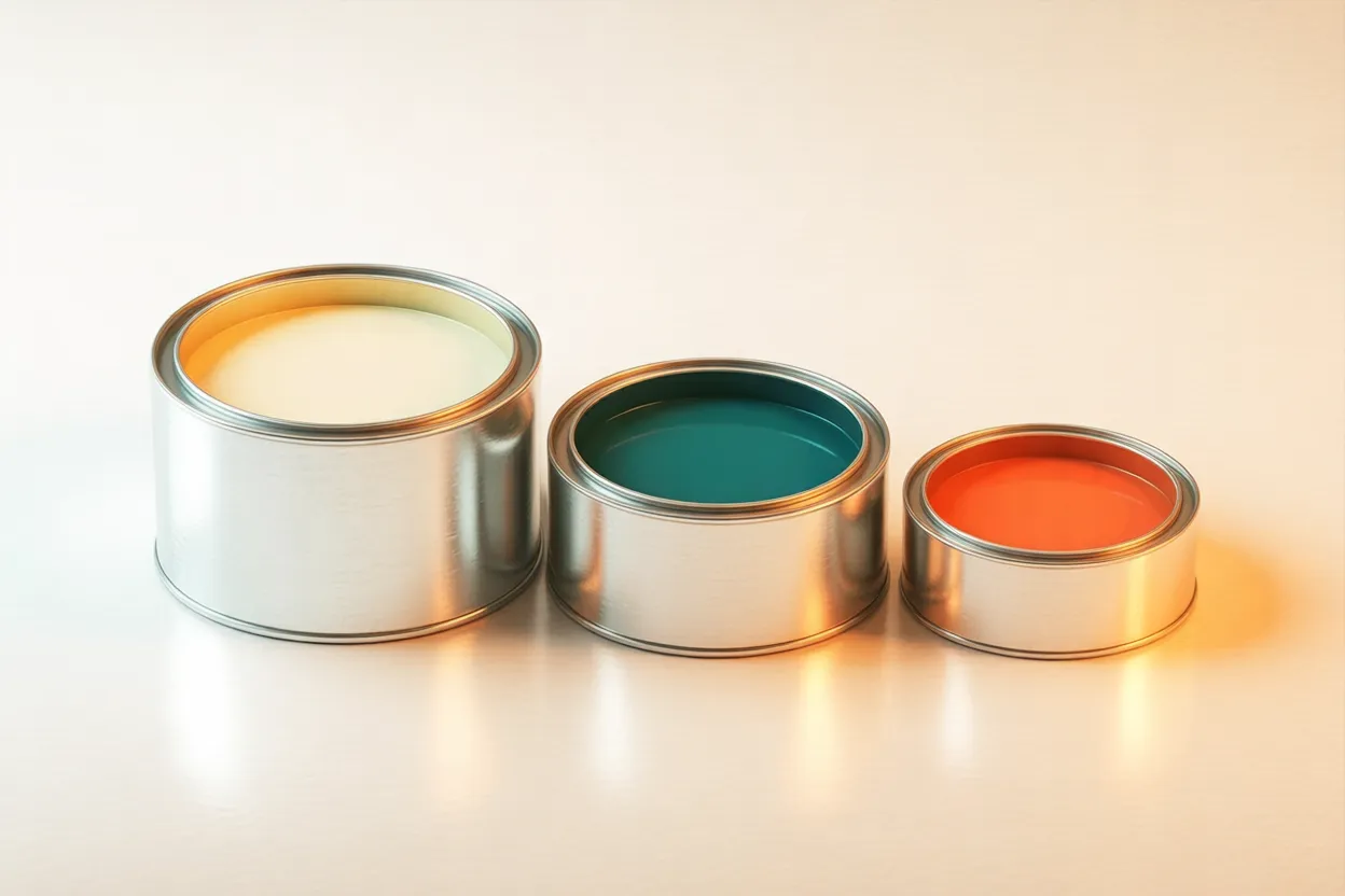
Web design 8 min Colors in Web Design: Color Psychology, Palette, Contrast That a particular color builds trust is not proven for websites. The contrast between two colors, on the other hand, can be measured. In web design, that means treating color psychology as food for thought, assigning colors by role and checking text and background for contrast.
 Article
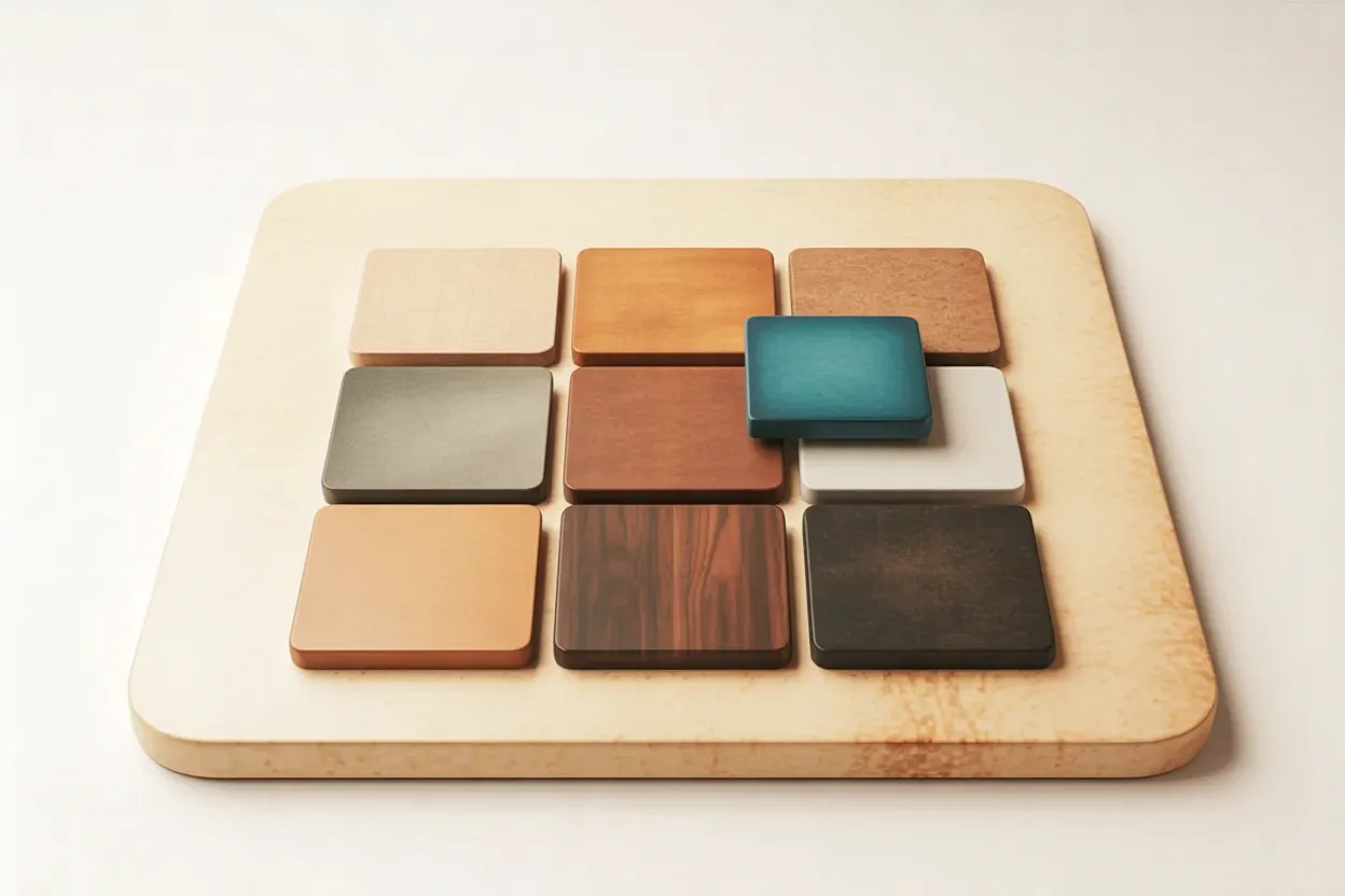
Web design 7 min The Color Brown in Web Design: Effect, Shades, Contrast The color brown recalls wood, coffee and earth and is seen as warm and down-to-earth. For craft trades, food and drink, and nature it suggests itself. Whether it supports trust on a website remains open, and it only stays legible with the right contrast.
 Article
Web design 6 min Creating wireframes: the plan for your website before the design begins Creating wireframes means planning a website on paper before anyone picks colours, photos or fonts. A wireframe shows which content sits on a page and in what order. For an SME, it is an inexpensive way to settle questions about structure before design hours add up.
 Article
Web design 9 min Online appointments on your website: booking without the email ping-pong A request comes in through the contact form in the evening, and the next morning three appointment proposals go back. By the time the reply arrives, one of them is taken, and every round of email leaves time to ask elsewhere. Online appointments turn that into a single step: whoever asks picks a free time themselves, and the appointment appears in both calendars.
 Article
UX & Content Strategy 8 min UX vs. UI Design: What's the Difference? A website can look outstanding and still fail. Website UX and UI sound similar but mean fundamentally different things — and the difference determines whether your website generates enquiries or loses visitors.
 Article
UX & Content Strategy 6 min User-Centered Design: Websites That Work for People Many websites grow from the inside out, built around the company rather than the people who visit. User-centered design flips that order. It starts with the needs of the people who should enquire. The result is pages that convert better and create less friction. This article shows how a UX workshop and customer journey turn your website into a tool for real enquiries.
 Article
Web design 5 min Dropdown Menus: When They Guide — and When They Lose A dropdown menu looks like the logical answer for a site with many pages — until it becomes a trap on mobile. Placed well, it guides visitors to their goal faster. Placed poorly, it hides exactly what people came to find.
 Article
Web design 7 min Web Animations: Purposeful Motion, Not Visual Noise An animation feels like a detail — until it gets in the way with every click. Well-placed web animations guide the eye and bring a website to life. Poorly placed ones cost speed, attention, and visibility.
 Article
UX & Content Strategy 8 min Conversion Optimization: Turning Website Visitors into Inquiries Many SMEs buy more traffic when the real leak is elsewhere: visitors arrive but never get in touch. Conversion optimization addresses exactly that. This article explains which conversion killers cost Swiss SME websites inquiries, why trust works better than persuasion, and how to assess your site's own condition.
 Article
Web design 11 min Web Design Icons: Sources, Formats and What Really Matters Icons seem like a detail — until forty of them carry the whole website. Mixing styles or choosing the wrong license shows on every screen.
 Article
UX & Content Strategy 8 min Web Accessibility: When It's Required – and When It Pays Off Many see web accessibility as a compliance checkbox for government agencies — or an expensive add-on that barely anyone notices. But it increasingly affects Swiss SMEs directly. This article explains who is required and from when, what the European Accessibility Act changes, and why accessible websites benefit every visitor.
No articles match these filters.

Book your free consultation:
Thank you. We'll get back to you shortly.
Common questions about UX, CRO & accessibility
What is UX and why does it decide success?
UX (User Experience) is the experience a visitor has using your site. Bad UX means visitors do not find what they look for, give up and do not return. Good UX means clear structure, fast paths, intuitive operation. UX investments pay back on every SME site — 20-50% conversion lifts are realistic after targeted UX work.
What is conversion rate optimisation (CRO)?
CRO is the systematic improvement of the site so more visitors become enquiries, purchases or sign-ups. With A/B tests, heatmaps and user feedback we check what works and what does not. Even small changes (button text, form reduction, trust markers) can lift conversion 10-30% — far cheaper than more advertising.
What does WCAG 2.2 mean for my site?
WCAG 2.2 are the international standards for web accessibility — contrast, font size, keyboard operation, screen reader support. In Switzerland, BehiG/eCH-0059 is mandatory for authorities; from 2025 many companies must also comply (EU European Accessibility Act). Noevu builds all sites WCAG 2.2 AA compliant and audits before launch.
Does accessibility help SEO?
Yes. Accessible sites have better semantic HTML, clearer heading structure, descriptive alt text and clean code — all factors Google loves. Studies show ranking improvements of 12-20% after accessibility work. Plus: you reach 10-15% additional users with impairments.