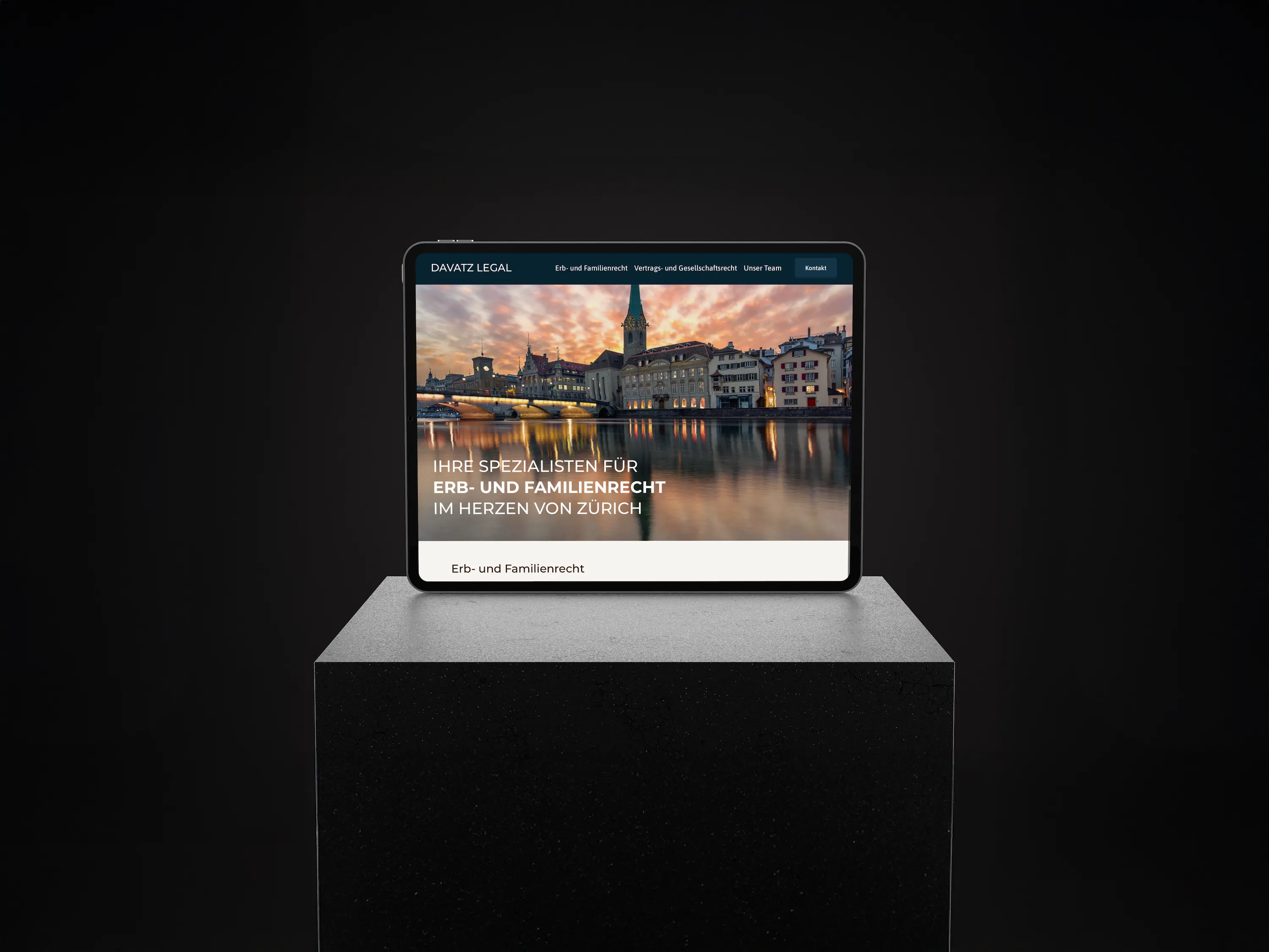
Wohnperspektive GmbH does valuable social work by supporting people in difficult life situations. This important mission deserved a professional digital form. Noevu was commissioned as a Squarespace Partner Switzerland to develop a completely new website.
The target
A user-friendly, clear and UX-compliant online presence that conveys the company's vision, creates trust and generates targeted leads. The result is a strategic communication base built on the "Golden Circle" principle — answering the question of "why" emotionally and persuasively.
The client's challenge
A sensitive social topic had to be communicated professionally, accessibly and with hope. The new website addresses several target groups: direct clients, but also social workers and social services as important intermediaries.
customer
- Wohnperspektive GmbH: A social enterprise that offers safe living and individual everyday support.
- Offer: Support for a self-determined, independent life as well as a “residential school” to promote skills.
- Target groups: clients, social specialist agencies and services that are financing partners
project
- Developing a new, professional website from scratch.
- Creating a clear, user-friendly and modern web design.
- Establishment of complete branding including logo design.
- Structured communication of the value proposition according to the “Golden Circle” principle (Why, How, What).
- Conception of a digital presence for the “residential school”.
Special features
- The need to build an emotional connection and convey hope.
- The development of a flexible logo family that also works bilingually (DE/FR).
- The clear strategic direction of not only informing, but also specifically encouraging people to make contact.
The solution: Strategic web design & development
Noevu goes beyond pure aesthetics. The approach was strategic and profound. The core brand message was sharpened first in workshops and worked out the "why" of Wohnperspektive GmbH: the belief that change is possible and that every person has the potential for a self-determined life.
1. Branding & Logo Development
The heart of the new brand identity is the motto "Home Is Where Growth Starts". The brief was clear: the branding had to translate this idea visually. Noevu worked with renowned Swiss graphic designer and brand expert Vincent Ghilione from Polychrome to realize this approach.
The result is a logo that combines warmth, security and positive development: an abstract image brand that fuses a protective roof with an upward pointing arrow. Combined with the elegant Chic Avenue font and a color palette of trusting dark blue and hopeful coral, a visual identity was created that is professional, approachable and profound. The entire logo system was also designed flexibly for bilingualism (DE/FR) right from the start - proof of forward-thinking website strategy.
2. Two paths, one goal: The design prototypes
Based on the defined brand strategy, two different but equally well thought-out visual routes were developed. These prototypes served as a basis for discussion to find the perfect tone for the final web design.
1. Design route: "A Bright Perspective"
This design was intended to specifically visualize optimism and new opportunities. A bright and warm color palette was used to convey hope and a new beginning.
- Visual elements: Large, wide-angle images symbolized openness and new horizons. Transparent surfaces and overlaps created depth and lightness.
- Design language: A combination of gently rounded elements (warmth, humanity) and clear, straight lines (structure, reliability) reflected the care approach.
2. Design route: "Hopeful Thoughts"
This approach focused on building trust through an atmosphere of security and positive development.
- Visual elements: Dark, calming tones combined with strong contrasts created an intimate yet encouraging mood. The targeted use of portraits should create a personal connection.
- Form language: Rounded image shapes stood for warmth and accessibility, while angular transitions and clear grids ensured structure and reliability - inspired by the potential logo symbol.
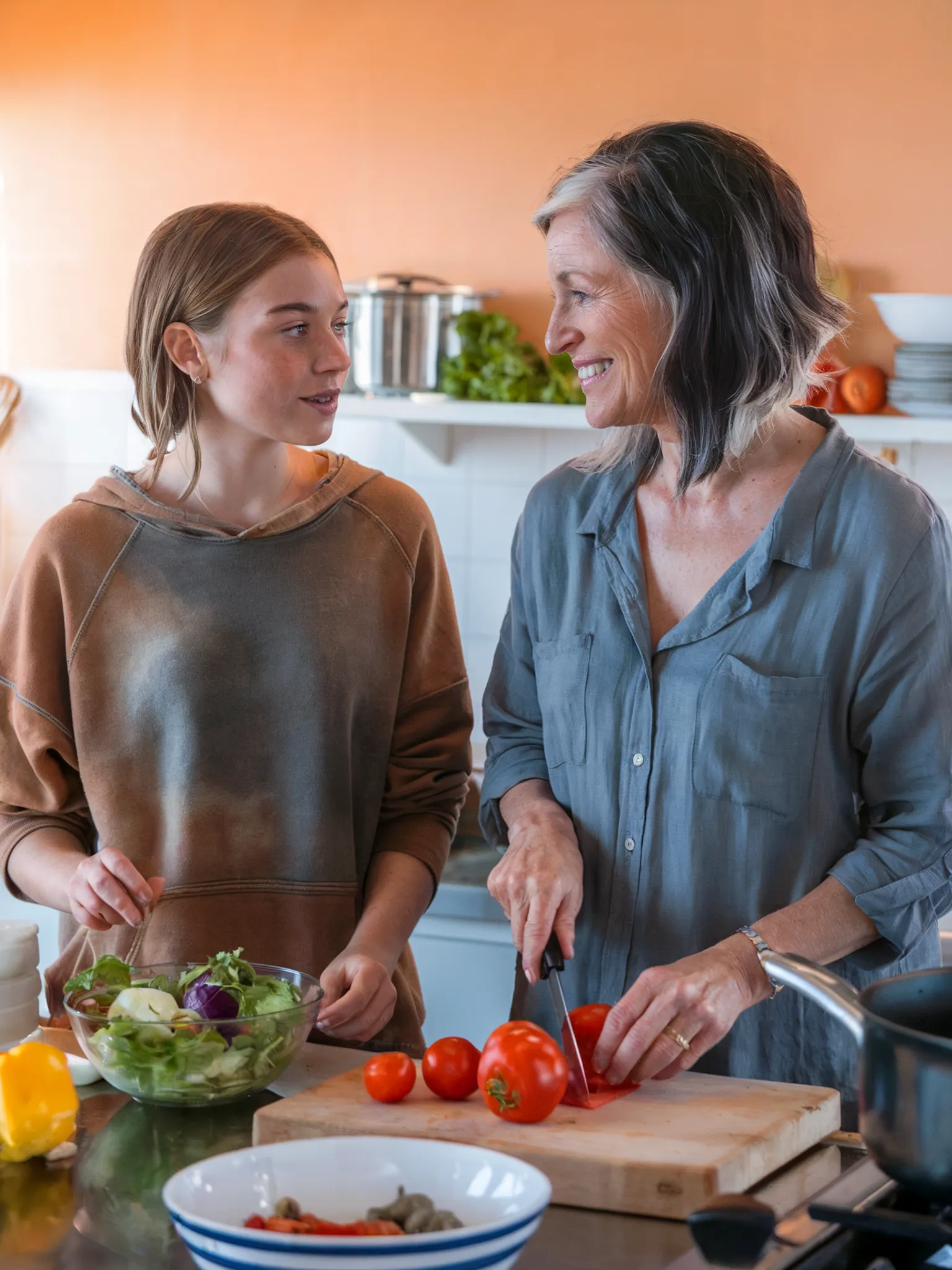
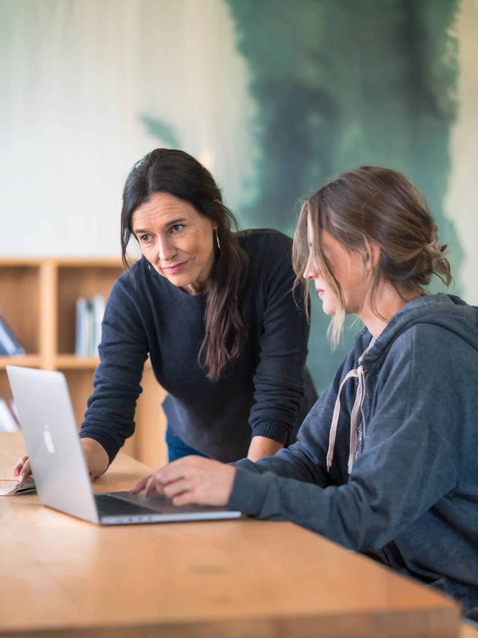
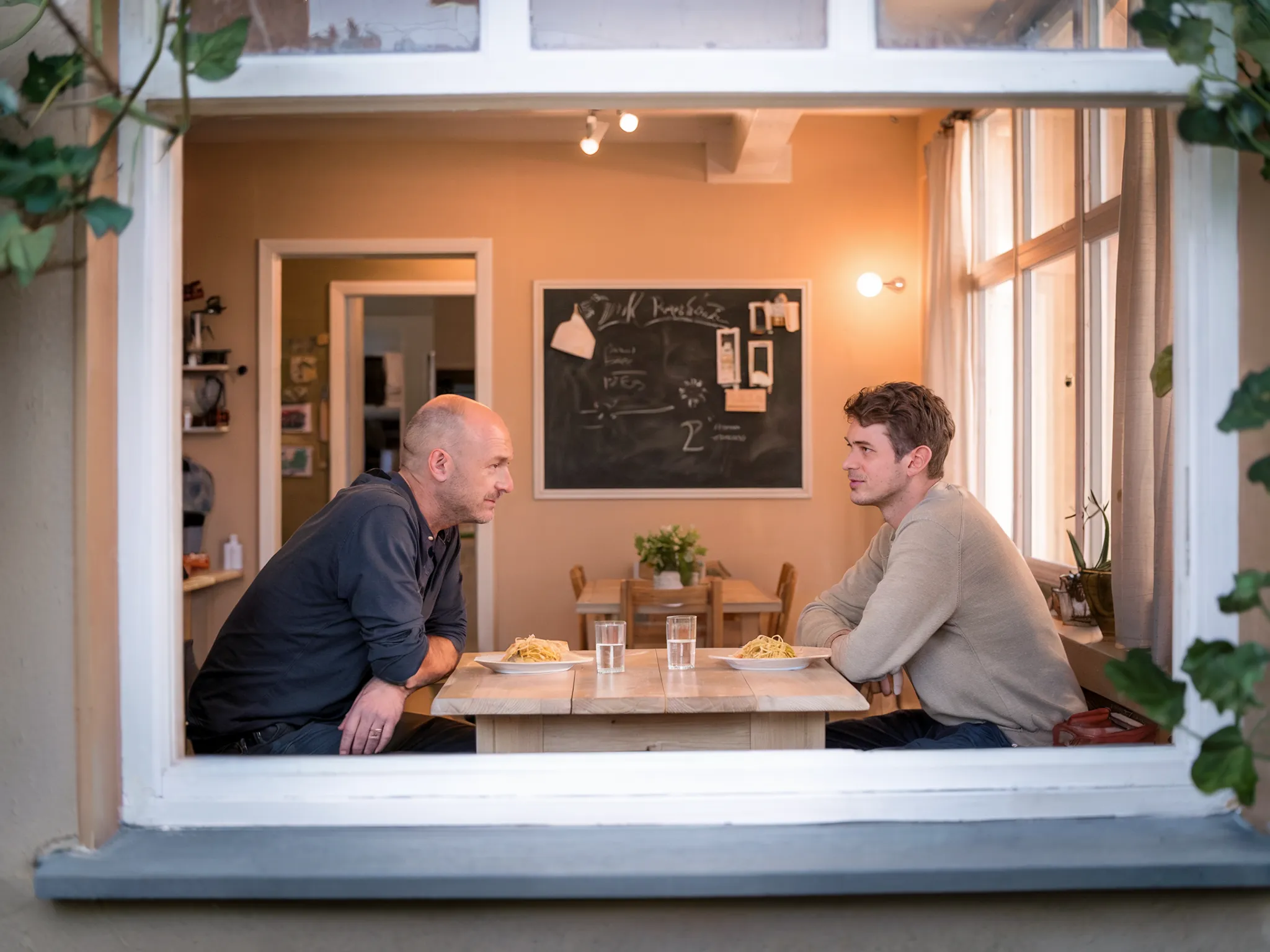
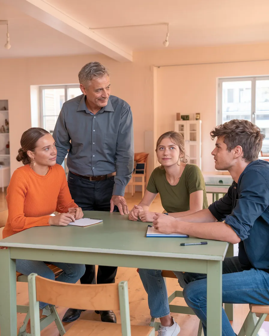
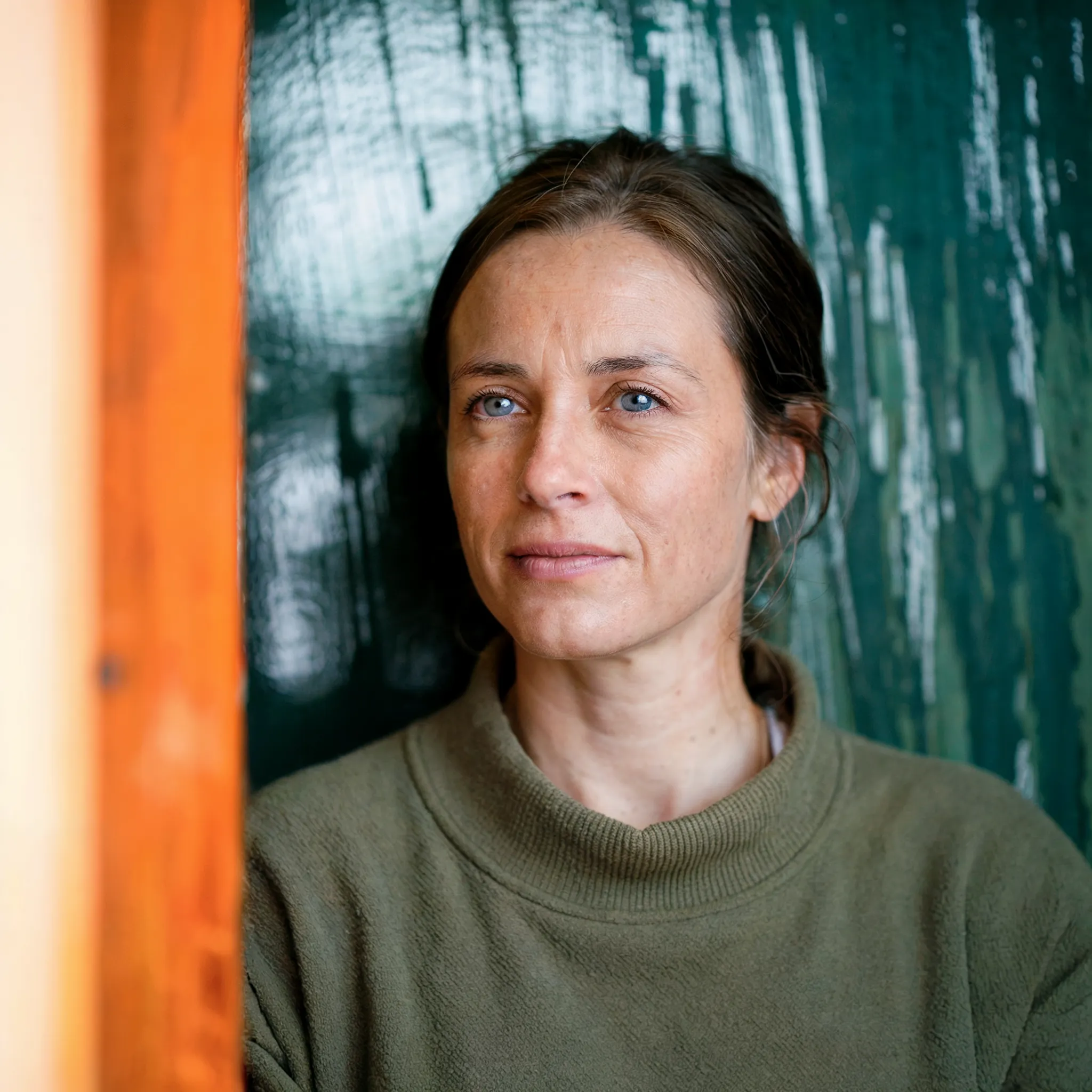
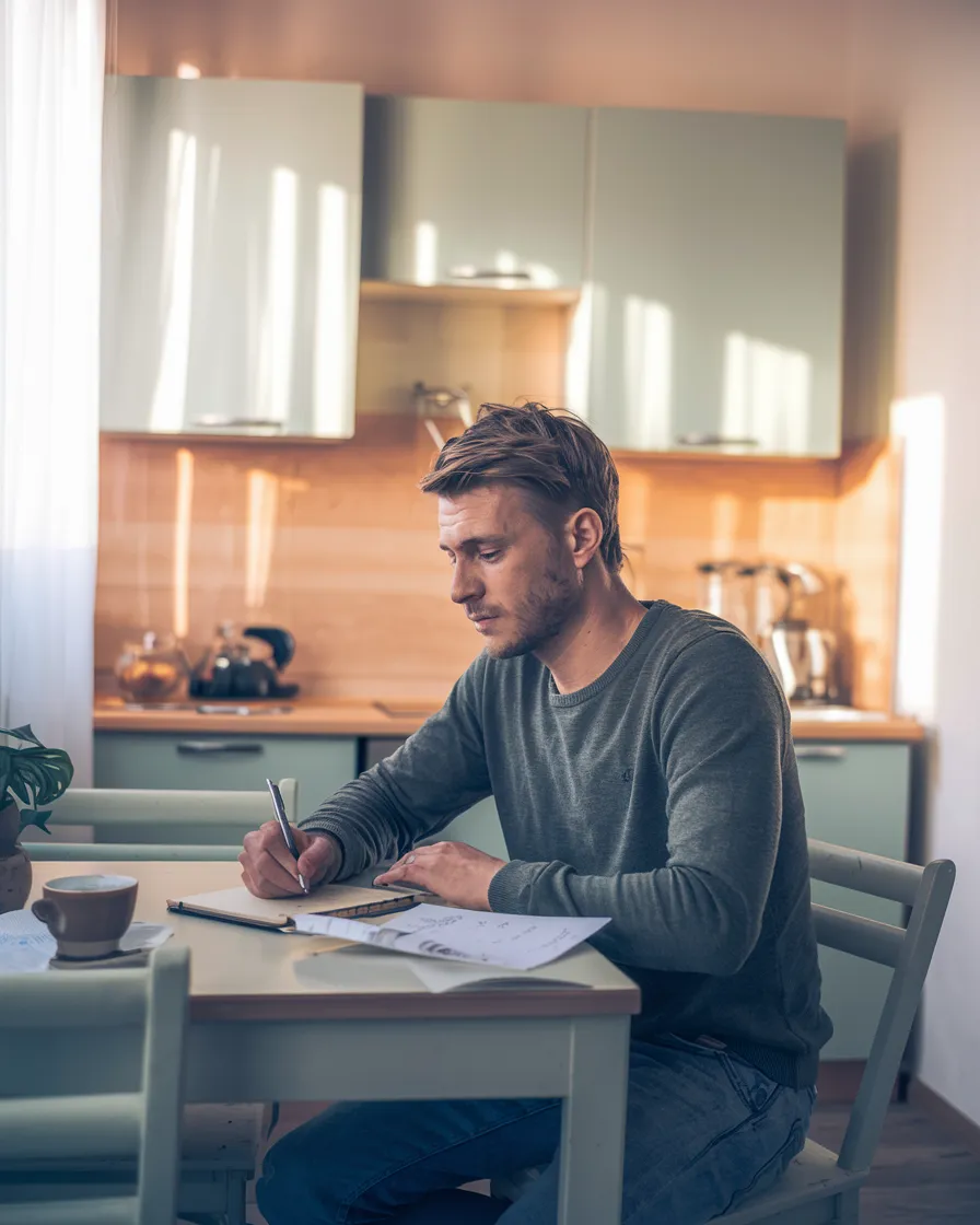
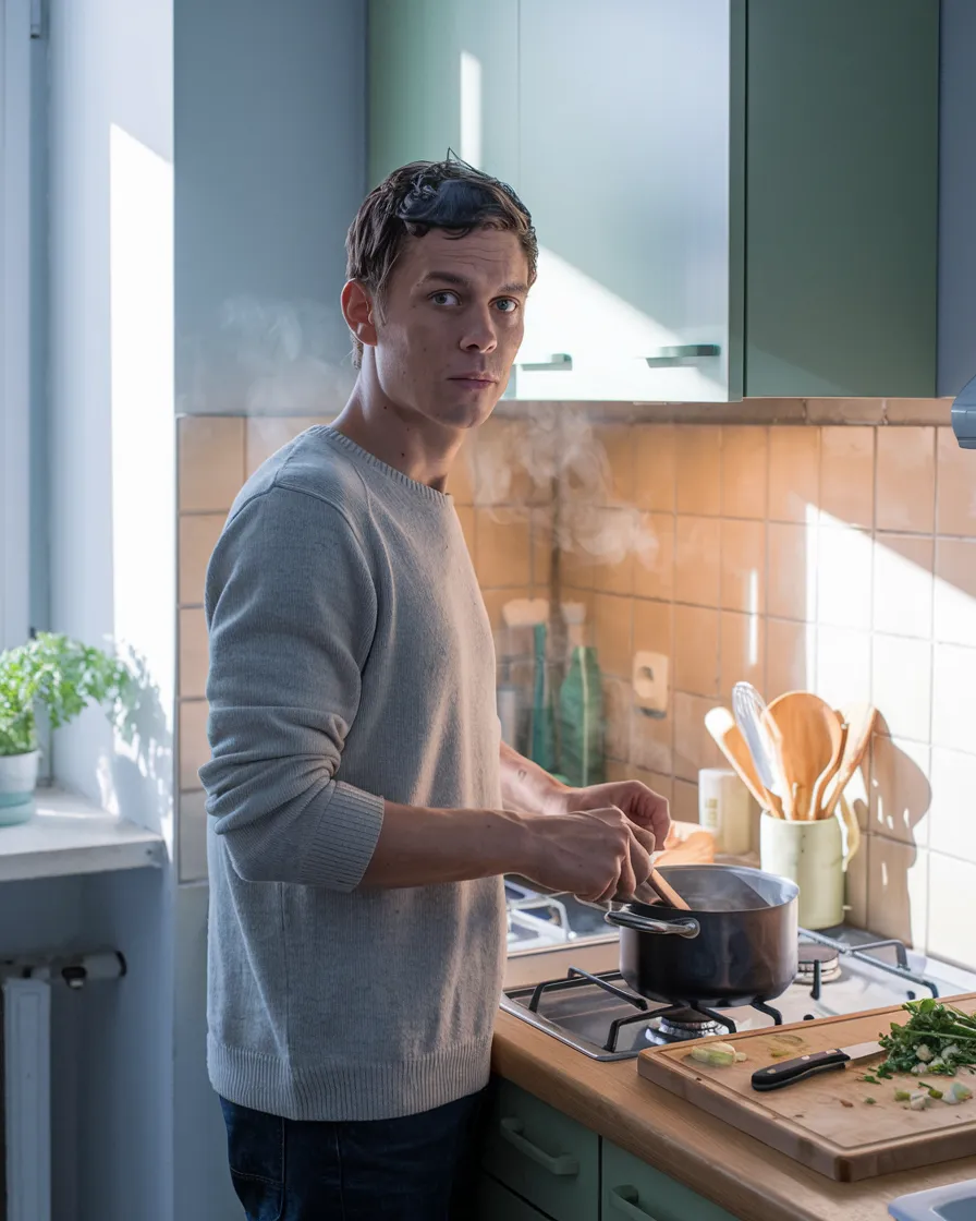
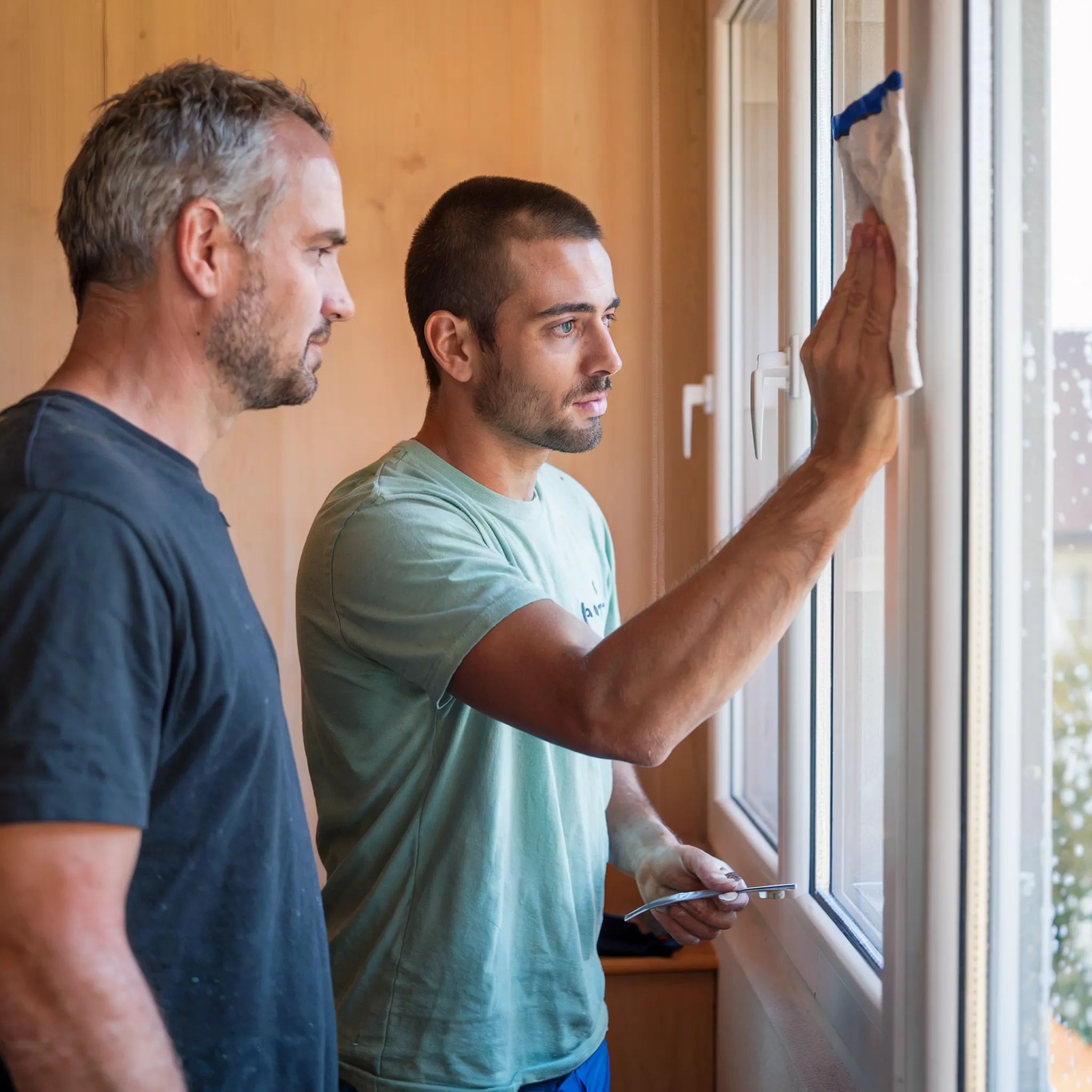
3. Original imagery through tailor-made AI
In order to stand out from impersonal and generic stock photos, Noevu created a unique and authentic visual world for Wohnperspektive. Instead of resorting to expensive photo shoots, a durable and efficient solution was developed: a tailor-made AI prompt system. This enables the team at Wohnperspektive to create new, brand-compliant visuals of the highest quality at any time.
- Custom-made prompt system: A system based on ChatGPT was built that generates precise, brand-compliant instructions for AI image creation and thus ensures visual consistency.
- Unique visual aesthetics: All images follow a specific color and light composition that fits perfectly with Wohnperspektive's corporate identity and creates a warm, hopeful atmosphere.
- Authentic representation: The images were deliberately designed to show people who are authentic and "drawn by life". This creates an honest connection with the target group and strengthens credibility.


The result – digital excellence and market success
The result is much more than a new website. Noevu built a complete digital identity for Wohnperspektive GmbH - from the strategic branding to the user-centered web design to the forward-thinking imagery. This coherent and professional presence creates trust and positions the company as a trusted provider in its niche.
The success speaks for itself: Through consistent strategy and the creation of SEO-optimized content, Wohnperspektive GmbH has achieved an outstanding result. After just a few months, the website is at the top of Google for relevant search queries in the Biel region. This success proves how effective the combination of in-depth brand strategy and technical excellence as a Swiss Squarespace expert is in creating sustainable visibility and measurable results.
The collaboration with Noevu was crucial. Noel Bossart and his team understood our vision and gave it a digital soul. The strategic, professional web design exceeded our expectations. We are perfectly represented and reach our target groups more effectively.
Looking for more than just a website? Noevu builds strategic digital presences that drive real results.