When the managing directors of the Migros compensation fund reached out, the starting point was clear: the existing Typo3 website was aging and the design seemed outdated. The request was a visual modernization — the site should be “pretty” again. But as the project progressed, it became clear that “pretty” was not enough. The goal became excellence.
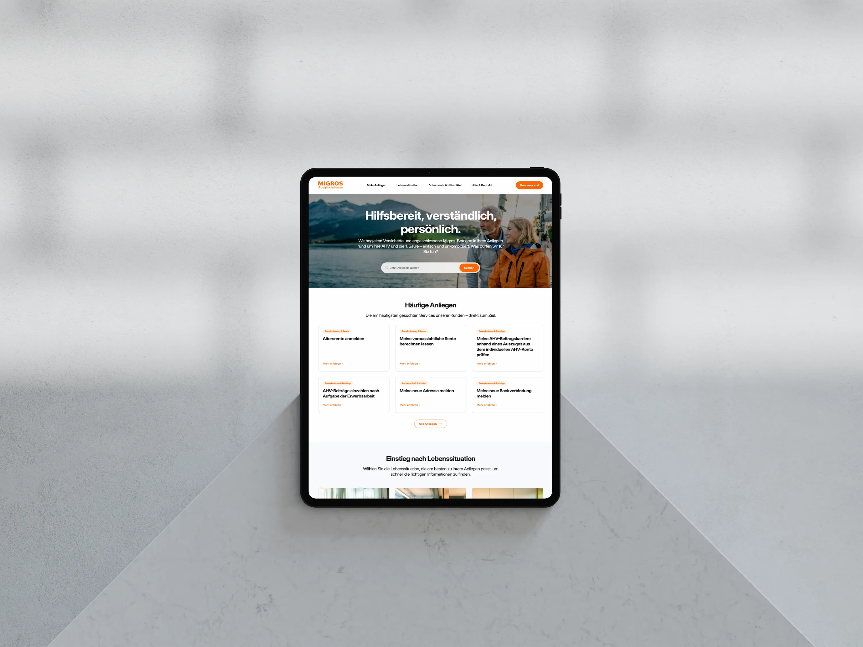
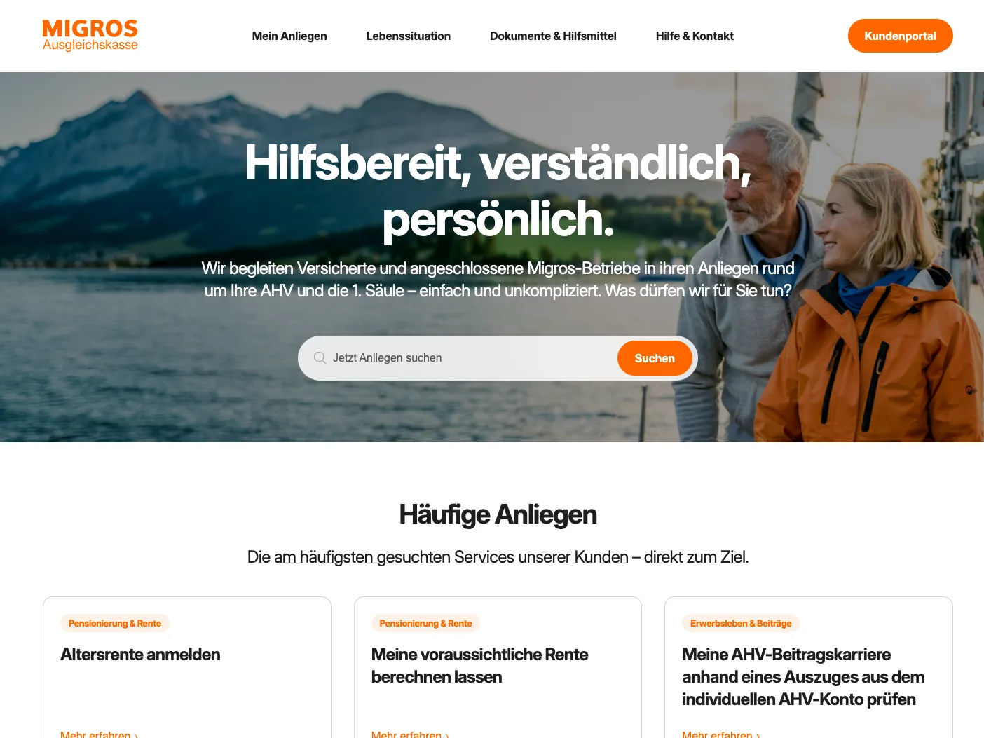
The result speaks for itself: The new akmigros.ch is currently the most compelling compensation fund website in Switzerland. But it is far more than an aesthetic shell. Since the AHV 21 reform, the website has become the most important service channel. Aesthetics and radical functionality were combined deliberately — because good design is not an end in itself. It enables the service that insured people expect today.
customer
- Migros compensation fund (AK Migros)
- 1. Pillar for Migros and affiliated companies and their insured persons
project
- Strategic UX consulting & workshops
- Content strategy & plain language editing
- Web design & development on Umbraco in collaboration with OPTEN AG
- Technical implementation & ISDS compliance
Special features
- Hosting: 100% Switzerland (ISDS compliant)
- UX: Navigation by use cases and 5 life situations
- Languages: 3 languages in German, French and Italian
- Design: Exclusive, AI-generated imagery in a Migros look
Why technical jargon and departmental thinking no longer work
Can a layperson on a typical compensation fund website immediately understand the difference between an “IK statement” and an “insurance certificate”? Most 1st pillar websites have grown historically. They reflect the internal organizational chart and use the language of legal texts.
This creates a high hurdle for users. They don't think in departments like “contributions” — they have a specific problem. When confronted with outdated design and incomprehensible official language, trust drops and they reach for the telephone. That unnecessarily ties up support resources. The Migros Compensation Fund project set out to prove that a government website can be modern, inviting and understandable.
How does structuring according to 5 life situations work?
The biggest lever in UX design for social insurance is the information architecture. For AK Migros, a joint UX workshop took off the internal glasses. Instead of depicting the fund's organizational structure, the navigation was aligned entirely to the lived reality of the insured.
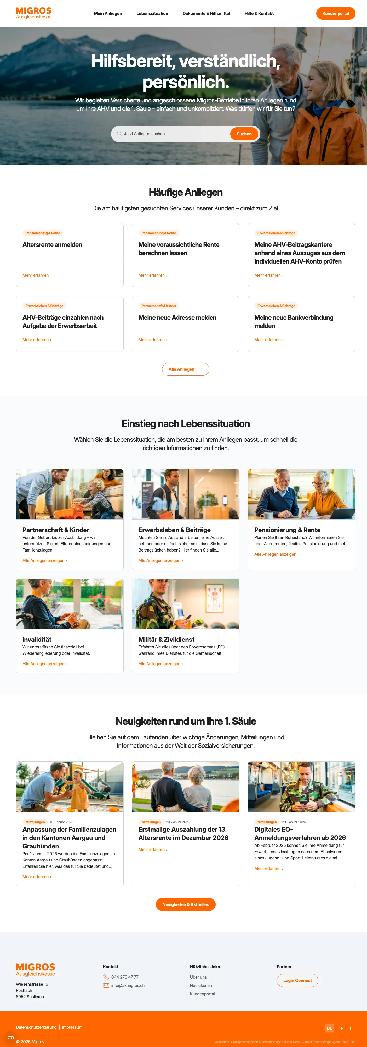
The content is now divided into 5 central life situations that users understand intuitively:
- Partnership & Family
- Working Life & Contributions
- Retirement & Pension
- Disability
- Military & Civil Defense
This approach meets users where they are emotionally. Anyone expecting a child clicks on “Family” without having to know what specific form is behind it. The design supports this clarity with plenty of white space and a tidy structure that exudes calm.
What are the benefits of "My Concerns" and User Intent Clusters?
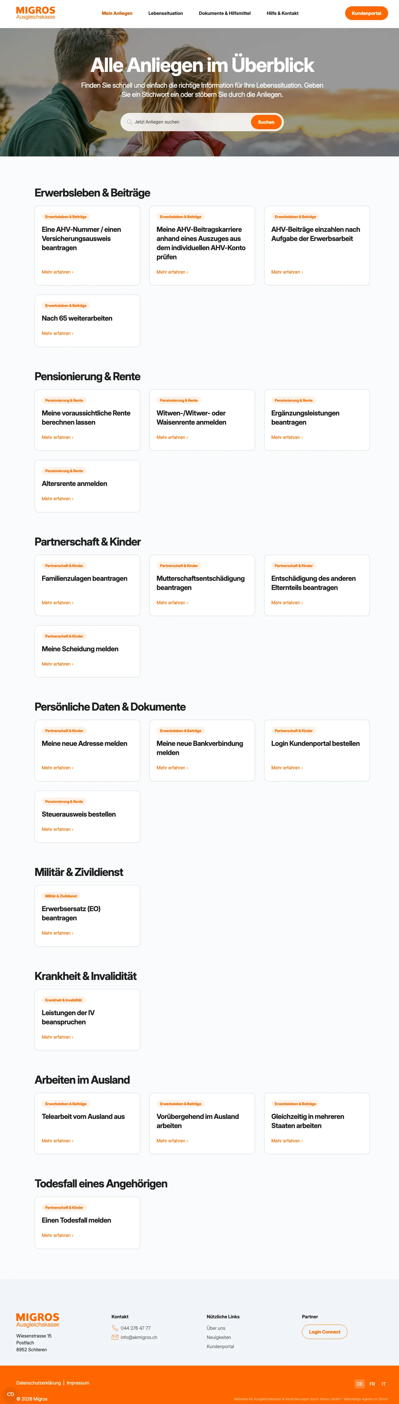
In addition to the life situations, the "My Concerns" area offers quick access for users who know exactly what they want. Whether “change address”, “order a bank statement” or “report a death” – these top tasks are prominently placed. This not only looks good, but also prevents long searches in submenus.
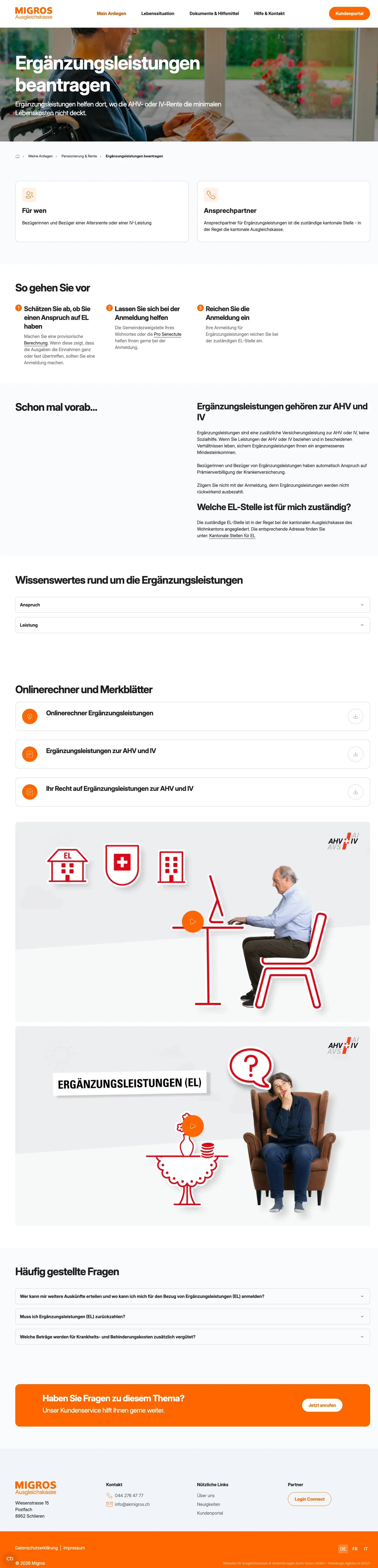
Rather than dropping a PDF at the user's feet, each topic is framed around three clear questions:
- What exactly does this concern mean? (Simple definition, no paragraph jungle)
- Who is affected? (Clear target group approach)
- Who to contact? (Direct contact or responsibility)
How do videos and design create trust?
To reduce hurdles further, the new site relies on multimedia. Where text alone seems dry, explanatory videos from the AHV/IV information center are embedded. They explain complex relationships visually and simply.
How to translate "authoritative" into understandable language
A polished cover is of little use if the text is incomprehensible. That's why the AK Migros project consistently applied Plain Language.
The visual design plays an equally important role: thanks to modern typography and high-quality imagery, the site reads as a modern service provider — not a bureaucratic authority. A noteworthy detail: the images, fitting perfectly into the familiar Migros look & feel, were generated using artificial intelligence (AI). This enabled cost-effective creation of an exclusive, consistent visual world. Data protection is strictly maintained: external content from YouTube or Vimeo loads only after the user actively consents (two-click solution).
Why not a SaaS solution like Webflow or Squarespace — but Umbraco as a CMS?
A website relaunch for a compensation fund must be stable and meet the highest data protection requirements. Data must remain in Switzerland — a knockout criterion for popular platforms like Webflow or Squarespace, which host their data in the USA.
AK Migros therefore consciously chose Umbraco:
- Hosting in Switzerland: All data remains in the country — as required for ISDS compliance, retained without compromise during the relaunch.
- Stability & operation: Umbraco offers an extremely high level of stability and remains easy to use for the AK Migros editorial team.
- Extended data protection: Going beyond mere ISDS compliance, Cookiebot was integrated alongside completely revised data protection guidelines, ensuring the website meets the latest legal requirements.
The relaunch of AK Migros shows that you don't have to make a decision: a website can be functional, secure AND beautiful. The courage to use design as a strategic tool, to translate technical jargon and to rely on Swiss hosting has resulted in a platform that sets standards in the first pillar.
For you as a compensation fund, this means: A relaunch is the chance to shed the dusty image. Show your insured people that you are a modern partner.
A website that is secure, user-friendly and visually impressive is within reach. Book a conversation to see in detail how this path was taken with AK Migros.
Frequently Asked Questions
Why does sorting by life events make sense for compensation funds?
Insured people usually do not look for technical terms such as 'EO', but rather for solutions to their situation (e.g. 'birth' or 'military'). A structure based on the 5 life situations makes navigation intuitive and reduces hurdles.
Where do the images on the website come from?
The images were generated using artificial intelligence (AI). This allowed cost-effective creation of exclusive imagery in the 'Migros look' — modern, perfectly on-brand, with no elaborate photo shoots required.
Is the new website barrier-free?
Absolutely. Access for all people is essential for a compensation fund. The site was developed taking into account common accessibility standards to ensure easy access for people with disabilities.
Why do you use Umbraco and not Webflow?
Swiss data hosting is often mandatory for compensation funds. Webflow primarily hosts in the USA. Umbraco makes hosting in Switzerland straightforward, offers greater stability and full control over data protection issues such as cookie consent.
What makes the new site better in terms of data protection?
In addition to Swiss hosting, the setup relies on Cookiebot for consent management, revised data protection guidelines and blocking of external content (e.g. videos) until the user grants permission.
Does Noevu provide post-go-live support?
Yes, Noevu offers comprehensive support after go-live. Service packages include hosting support, security, support hours and continuous optimization to keep the website current and effective long-term. Training is included so content can be maintained independently.