- Color psychology is barely proven for websites
- A palette needs a clear role for each color
- Text from 4.5:1, large type and button outlines from 3:1
- Color should never be the only signal
- 60-30-10 is a rule of thumb, not a standard
Color psychology in web design: what is proven
Color psychology studies how colors influence feelings and behavior. For websites, little of it is proven: many findings come from small lab studies and are considered preliminary. A fixed pairing such as «blue builds trust» cannot be derived from them.
The psychologist Andrew Elliot described the field in 2015 in a review article as still young and methodologically tricky. The paper advises patience and caution when drawing conclusions for practice. What gets reported are mainly narrow lab findings, such as that seeing red shortly before a thinking task can lower performance.
Percentages such as «85 percent of purchase decisions depend on color» also make the rounds in guides. No verifiable primary source is known for it.
| Assessment | What it means for your website | |
|---|---|---|
| «Blue builds trust» | Not proven | More reliable than the color: clear information, readable pages and visible people can be checked and improved |
| «A red button sells more» | No general evidence | Whether a button stands out also depends on its contrast with the surroundings. That value can be measured |
| Red before a thinking task can lower performance | Individual lab findings, preliminary | Cannot simply be transferred to a website |
| Enough contrast is a precondition for readable text | Measurable standard (WCAG) | Can be checked with a number, as the section on color contrast shows |
Assessment based on the state of research, not a promise of effect.
As food for thought, color psychology is still useful, for instance for the question of what mood your site should have.
That blue supposedly builds trust or red raises sales is not a good reason for the main color. There is no general evidence for either. A better yardstick is what your brand stands for.
Choosing a color palette in web design: roles instead of favorite shades
A website palette can be spread across three roles. The main color stands for the brand, neutrals form surfaces and text, the accent marks buttons and links. Signal colors for error and success messages usually come on top. Assigning colors by role means not deciding anew on every page.
The 60-30-10 rule divides the area of a page: 60 percent neutral, 30 percent main color, 10 percent accent. It comes from interior design, where it counts as a guideline, not a strict rule. For websites it is not proven, but it still works as a starting value: the accent stays scarce.
The accent has a job: it shows what can be clicked. It therefore belongs on buttons and links, not on whole surfaces. As soon as everything stands out, nothing does.
Color combinations: when colors work together
Colors work together when the roles are clearly separated and every pair of text and background has enough contrast. The classic color harmonies are starting points, but no guarantee. How well a combination works only shows in the draft of a real page.
Related colors
Complementary colors
One hue in steps
The sample palette relies on complementary colors. Rust Orange sits roughly opposite blue on the classic color wheel of painting and differs clearly in hue from Midnight Blue. In lightness, however, the two are close together, and the contrast is only 2.1:1. Rust Orange therefore does not work as text on Midnight Blue. On Paper, Rust Orange reaches 4.9:1 and works there for links and buttons, and white text in the button reaches 5.4:1. How the same calculation looks for a single color is shown in the article on the color brown, with a sample palette and contrast values.
Color contrast: which color pairs stay legible
Under WCAG 2.2, the international guidelines for accessible websites, normal text needs a contrast ratio of at least 4.5:1. Large text and the outlines of interface controls, such as the border of an input field, need at least 3:1. The ratio measures the lightness difference between two colors, from 1:1 (no difference) to 21:1 (black on white).
Text counts as large from 18 point, or from 14 point bold, which is about 24 and 18.5 pixels. The values apply without rounding: 4.49:1 does not pass. The W3C explanation lists the thresholds for text and the exceptions, such as for logos. For the outlines of interface controls, a separate criterion applies.
Two pairs are typical pitfalls. Light-gray hint text on a light background reaches only 2.4:1 here. White text on a yellow button comes in at 1.8:1, while dark ink on the same yellow reaches 8.5:1. With light yellows, dark text is therefore the better choice.

The button at rest is only one part of the check. The frame when tabbing through the page, the button under the mouse pointer and error messages also need enough contrast. Otherwise the cue is missing where it is needed.
For the Swiss federal administration, the eCH-0059 standard (version 3.0) is mandatory. It requires WCAG 2.1 at level AA, the middle of three levels. The thresholds mentioned belong to that level in both WCAG versions. What applies to private websites is covered in the article on web accessibility.
Color vision deficiency: color never as the only signal
About 8 percent of men and 0.4 percent of women have a color vision deficiency (gesund.bund.de, as of 2021). Color must therefore never be the only signal: whatever it indicates needs a second cue such as text, a symbol or an underline.
The figures come from the health portal of the German Federal Ministry of Health. The rule itself appears in WCAG 2.2 as success criterion 1.4.1 at level A, the lowest of the three levels.
Links and buttons
Forms
Status and charts
Five questions before the website goes live
Five questions show whether a palette works. They can be answered on the first draft, before the website goes live.
- Does every color have a role as main color, neutral, accent or signal?
- Does normal text reach 4.5:1, and large text and every interface outline 3:1?
- Is the accent reserved for what can be clicked?
- Does every piece of information also work without color?
- Does the palette fit the brand without any text promising a color effect?
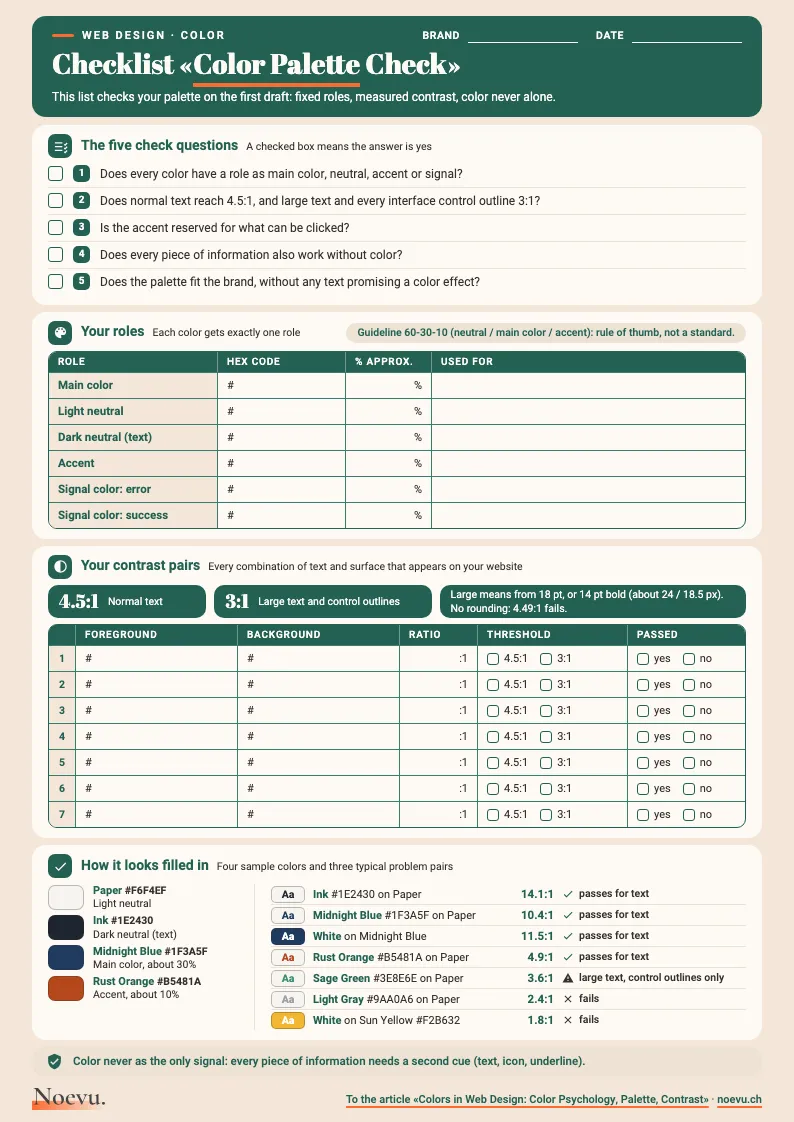
Checklist «Color Palette Check»: one page to fill in
The five check questions as a checklist, with room for your color codes. Plus two tables in which you enter roles and contrast pairs and tick them off against the 4.5:1 and 3:1 thresholds.
Thank you. Your download will start shortly.
Conclusion: from palette to brand presence
Color psychology offers food for thought for websites, but no rules. What is reliable: roles, contrast values and a second cue for every color that indicates something. Which shades belong to the brand is something you decide in the briefing.
More on color, type and images as a whole is in the article on corporate identity for SMEs. If the palette comes about as part of a relaunch, you will find the service under custom website design.

In a short conversation, we work out together which palette fits your brand and what a relaunch would need for it.
Frequently Asked Questions
What does color psychology say about colors in web design?
For websites, hardly any reliable rules can be derived from color psychology. Many findings come from small lab studies and are considered preliminary, and fixed pairings such as «blue builds trust» are not proven. Contrast is more reliable, and you can measure it.
What is the 3-color rule in web design?
The 3-color rule spreads a palette across three roles, not three hues. The main color stands for the brand, the neutrals for surfaces and text, the accent for buttons and links. It is a rule of thumb from design and not a web standard. Signal colors for error and success messages usually come on top.
What does the 60-30-10 rule mean?
The 60-30-10 rule sets proportions: 60 percent neutral, 30 percent main color and 10 percent accent. It comes from interior design, where it counts as a guideline, not a strict rule. For websites it is neither a standard nor proven, but it works as a starting value so that the accent stays scarce and stands out.
Which colors look professional?
That certain colors look professional is not proven. The impression is probably shaped more by clear roles, few hues and readable pages than by a single hue. It is therefore worth checking contrast and order first and the hue afterwards.
Which color combinations work for web design?
A combination works when the roles are clearly separated and every text pair reaches the contrast values. Related colors are considered calm, while complementary colors make an accent stand out clearly. Whether a combination fits the brand is something you settle in the briefing.
How many colors can a website have?
There is no fixed number. Often one main color, one or two neutrals and one accent are enough, plus signal colors for error and success messages. What matters is that every color has a job.
How do I check the contrast of two colors?
Contrast is the ratio of the lightness of the two colors, calculated with the WCAG formula. An online checker such as the WebAIM Contrast Checker calculates the value once you enter both color codes. Normal text needs at least 4.5:1, large text and the outlines of interface controls 3:1.
How do I find the color code of a color on a website?
A color code is a six-digit value such as #1F3A5F. The easiest way is to ask the agency that built the website. Looking it up yourself works in the browser: a right-click on the element, «Inspect» from the menu, then a click on the color in the panel.