- Red stands for energy, love and warning
- The claim that red sells more is unproven
- Attention mostly comes from contrast, not from red
- Pure red (#FF0000) on white falls short for body text
- Red never alone, always with text or a symbol
What does the color red mean on a website?
Red is one of the loudest colors on a page. Red recalls fire, tomatoes and hearts, but also traffic lights, stop signs and error messages.
The common reading names energy, warmth and love on one side, and danger, prohibition and urgency on the other. So red has two meanings that can contradict each other. Which one applies depends on the setting: next to a heart it reads as love, next to an exclamation mark as a warning. Culture shifts the meaning too. In Europe the warning comes to mind first, in China red is seen as a lucky color.
For your website, what counts most is how much red appears where. A single red usually draws the eye, a lot of red can become pushy and quickly looks like a warning. The shade itself matters too: deep bordeaux and bright coral are worlds apart.
The effect of red: a reading, not proof
There is no proof that red affects everyone the same way. Early lab studies found that seeing red shortly before a thinking task can lower performance (Elliot et al., 2007). Later replications and a 2020 meta-analysis barely support this. It is an example of how carefully claims about the effect of color should be read. This article is not aware of any solid measurements of red on websites.
You should not write «red increases sales» on your site. The claim is not proven. It is better to say what red stands for in your industry, such as indulgence, speed or action.
Red buttons: why red stands out and when it helps
Red stands out because it contrasts with most pages. An often-cited single test counted more clicks on a red button than on a green one. Whether it was the color itself or how far it stood apart from the rest of the page that tipped the balance cannot be read from it. As a general rule, the statement «a red button sells more» is not proven.
Attention comes mainly from contrast: what stands apart gets noticed. You can switch between the versions and see how the eye shifts when red stands alone, appears three times or sits on a red surface.
Where the eye goes
The same product card in three versions. What mainly changes is where red appears.
One red accent
Red in three places
Red surface, white button
Red helps where it is the only strong highlight and stands out clearly from the background. The examples are a guide from design practice. Only a test on your own site shows whether a button performs better with your visitors.
Which industries red fits
Red suggests itself where visitors already expect indulgence, speed or action. Three fields come into question, each with its own tone.
| Suitable shades | What you should watch for | |
|---|---|---|
| Food and drink (pizzeria, wine bar, butcher's) | Tomato red, wine red, bordeaux | Red mixed with cream or wood, so it does not look garish |
| Retail and promotions (online shop, specialist store) | Strong red, coral | Red only for promotions, otherwise the cue loses its effect |
| Sport and energy (bicycles, fitness, motorsport) | Bright red, with anthracite | Plenty of white space, so speed does not tip into restlessness |
The mapping is a rough guide from design practice.
It gets harder where red means something else. With financial products red often stands for loss, in health and care for an emergency. There, red should be used sparingly, for example for a single cue, leaving the rest to calm shades.
Using red on a website: three roles
On a website, red can take on three roles: action, brand and signal. If you separate the roles early, red stays easy to understand.
Red as action
Red as brand
Red as signal
The classic Swiss Army knife by Victorinox shows that red can last as a brand color: the red is a firm part of the product's image.
It gets tricky when red is your brand color: then an error message looks like a button. The signal should get a sign of its own, such as a symbol and a word. If you also want to separate the shades, the darker bordeaux works for buttons, and the red stays reserved for errors.
A well-known rule of thumb splits the area into 60 percent base tone, 30 percent second color and 10 percent accent. With red, the accent is often the red itself, and the base tone a light neutral such as cream.
A red palette to try out
The example shows three reds, two light neutrals and one counterpoint. The values are a suggestion to test.
Bordeaux takes the text and headings, Red the buttons and links, Cream the background. Coral stays for individual spots and large elements. Rosé separates areas without getting loud. These roles are usually enough to build a page, and the contrast check comes next.
Contrast and color vision deficiency: when red stays legible
The trap is two shades: the purest screen red (#FF0000) and the bright Coral. Both stand out, but fall below 4.5:1. Pure red reaches only 4.0:1 on white, white text on Coral only 3.7:1.
The Web Content Accessibility Guidelines (WCAG) require a contrast ratio of at least 4.5:1 for normal text. For large text (from about 24 px, or 19 px in bold) and the outlines of interface controls, 3:1 is enough.
Besides legibility, there is color vision deficiency. According to Helsana, around 8 percent of men and less than 1 percent of women have limited color vision. Red and green are affected most often. That is why red must never be the only information. A link needs an underline, an error message text and a symbol. The article on web accessibility explains when such requirements become mandatory.

It is worth looking at your site in grayscale once, for example with the grayscale filter in your phone's accessibility settings. Whatever can no longer be recognized there as a button, link or error differs only in hue, not in lightness.
Complementary colors of red and good combinations
On the classic color wheel, green sits opposite red; on the screen color wheel it is cyan, a blue-green. A dark, muted pine green gives the palette tension. It is, however, almost as light as the red of the palette (only 1.4:1). That is why the two should be separated by cream or white and never placed edge to edge. Pure green next to red, on the other hand, quickly looks like Christmas and is hard to tell apart for people with red-green color deficiency.
Three combinations are worth a first test. Red with cream or white looks clear and classic, and the contrast is high. Red with anthracite looks strong and serious when cream or white in between provides space. Pine green creates a clear contrast when the green serves as a dark surface with light text. The red then sits beside it instead of on it.
Does red fit your brand? Three key questions
Before red goes into the brand decision, three questions help:
- Do visitors in your industry expect indulgence, speed or action?
- Can red be used legibly in a dark, a medium and a light shade?
- Does the color fit what your company should stand for in five years?
With three yeses, there is a fair case for red. If the answer to the first question is no, as with financial products or in care, you should use red only for a single cue. If the third is a no, your company's positioning deserves a look. The color follows the brand. If the second is a no, the palette and contrast values above will help.
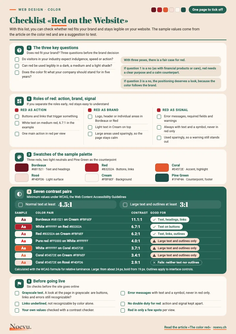
Checklist «Red on the Website»: one page to tick off
In five sections, the checklist takes you from the three key questions through roles and swatches to contrast and going live. It includes the swatches of the sample palette and seven contrast pairs with their values.
Thank you. Your download will start shortly.
Conclusion: from color to brand presence
Color is one part of a brand's presence. Anyone planning a relaunch first clarifies what the company should stand for, and colors, type and images follow. Which colors, type and images belong to the brand is settled in the design briefing before the first draft. The basics are in the articles on corporate identity for SMEs and on visual language. The article on the color brown in web design shows how a calm earth tone is used on a website. The custom website design page shows how the process for a new website works.

In a short conversation, we work out together whether red fits your brand and what a relaunch would need for it.
Frequently Asked Questions
What does the color red mean?
In the common reading, red stands for energy, warmth and love, but also for danger, prohibition and urgency. Setting and culture shift the meaning: in Europe the warning comes to mind first, in China red is seen as a lucky color. That is why it counts as a tendency, not a fixed value.
Does a red button work better?
As a general rule, this is not proven. An often-cited single test counted more clicks on a red button than on a green one. Whether it was the color or how far it stood apart from the rest of the page that tipped the balance cannot be read from it. A button stands out when it contrasts with its surroundings. Only a test on your own site shows whether that works with your visitors.
Which industries does red suit?
Red fits where visitors expect indulgence, speed or action, as in food and drink, retail with promotions, or sport. With financial products red often stands for loss, in health for an emergency. There red stays a single cue, and calm shades do the rest.
Which colors go with red?
Cream and white make calm backgrounds, anthracite looks strong and serious, and a muted pine green sets a counterpoint. The difference in lightness matters more than the hue, and with any combination it pays to check the contrast.
What is the complementary color of red?
On the classic color wheel, green sits opposite; on the screen color wheel it is cyan, a blue-green. In practice a dark, muted pine green works well. Because red and green are hard to tell apart for people with red-green color deficiency, the combination needs a clear difference in lightness. The Pine Green of the sample palette is almost as light as the red (1.4:1), so cream or white separates the two.
What contrast does red text need?
The Web Content Accessibility Guidelines require at least 4.5:1 for normal text. For large text and the outlines of interface controls, 3:1 is enough. The purest screen red (#FF0000) reaches only 4.0:1 on white and is therefore only enough for large text. A darker red such as #B3202A reaches 6.2:1 on cream.
What is the hex code for red?
There is no single value. In CSS, the language that sets how websites look, the name «red» stands for #FF0000, the purest red a screen can show. For a brand, a shade of its own in three steps is worth it. Dark serves text, medium buttons and links, light backgrounds.
Is red a problem for people with red-green color deficiency?
It is when red remains the only information. Around 8 percent of men and less than 1 percent of women have limited color vision. Red and green are affected most often. An error message therefore needs text and a symbol, a link an underline.