What website UX means — and what UI means
UI stands for User Interface — everything that is visible: colours, shapes, typography, the layout of a page. UX stands for User Experience — everything that is tangible: how intuitively someone finds what they are looking for, how clear the next step is, whether they reach their goal.
Both terms are connected, but they are not the same thing. UI is the craft of presentation. UX is the craft of experience. A website can have flawless UI — cleanly designed elements, a considered colour palette, professional typography — and still have poor UX, if the form has too many fields, the contact path is too long, or the offer remains unclear on first reading.
The difference can be summed up in one question: does the visitor reach their goal — and do they do so without searching or hesitating?
When good UI hides poor UX
The most prominent example of the year comes from Apple. The new iOS design with its «Liquid Glass» concept undeniably has visual class: translucent surfaces, fluid transitions, an aesthetic that immediately stands out. Yet since launch, reports of usability problems have multiplied — contrasts too low for poor lighting conditions, interactive elements hard to distinguish from decorative ones, text on transparent backgrounds barely legible in certain contexts.
This is not an Apple-specific problem, but a textbook example of a universal tension in design: what is visually striking does not necessarily convince functionally. A design award does not mean users accomplish their goal.
For Swiss SME websites, the same question applies: does the site look impressive — or does it also feel impressive to use?
The difference can often be uncovered with a simple test: ask someone who doesn't know your website to complete a specific task — such as sending an enquiry or finding a service. Observe where the person hesitates, goes back, or searches. That is exactly where the UX weakness lies — regardless of how good the site looks.
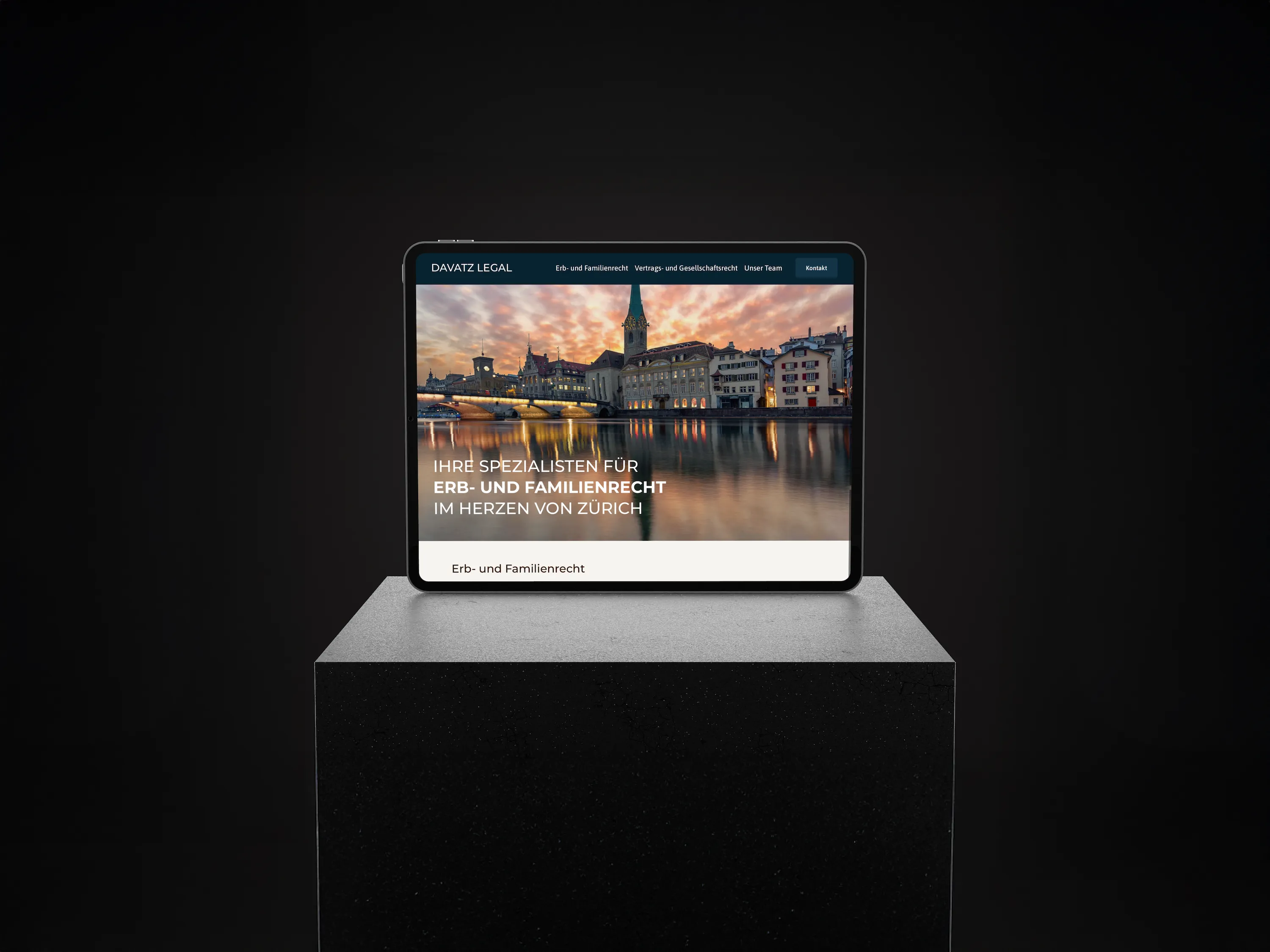
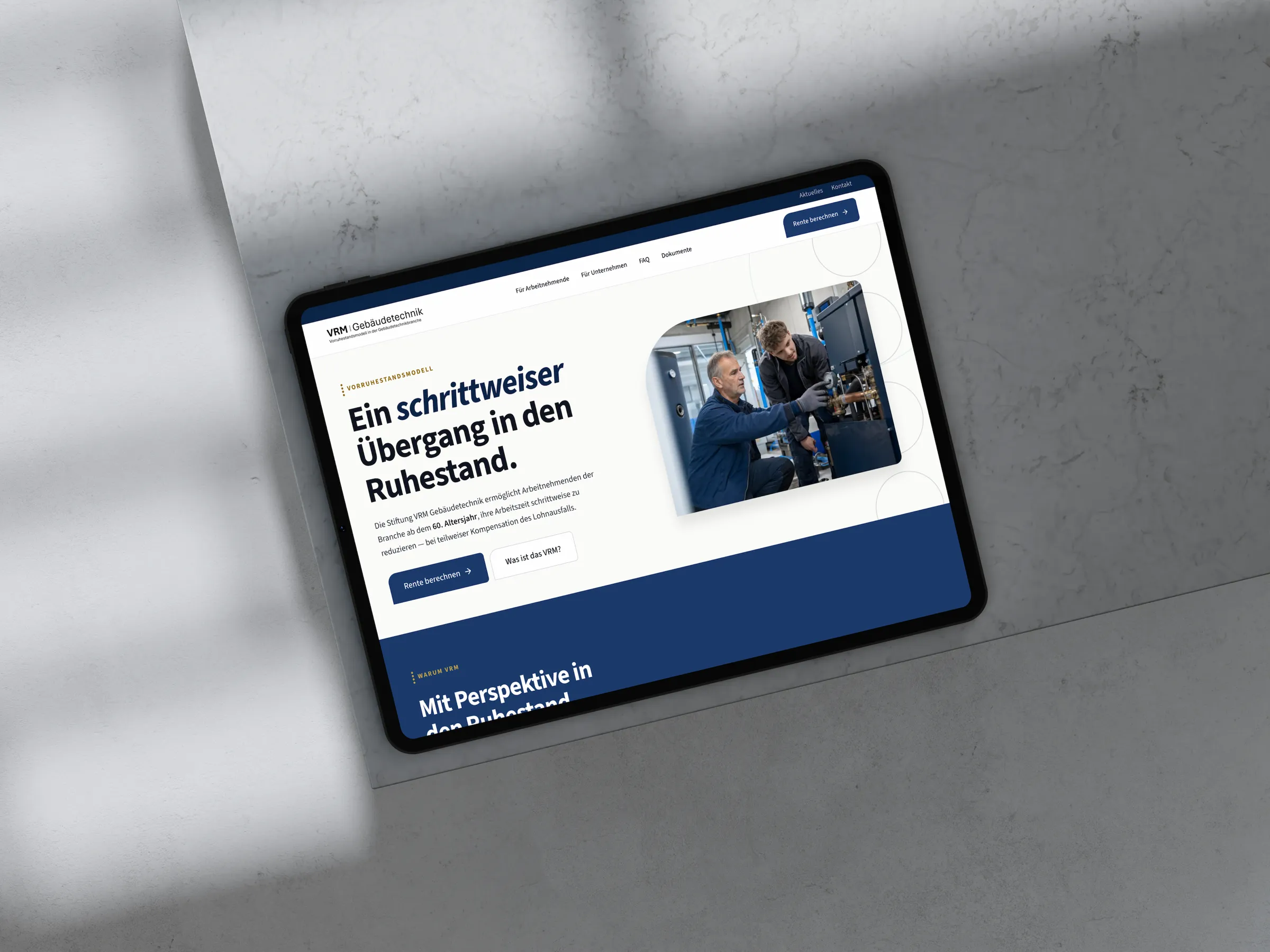
UX in practice — two Noevu examples
Good user experience shows most clearly when complex processes become simple. Two projects from our work illustrate this concretely.
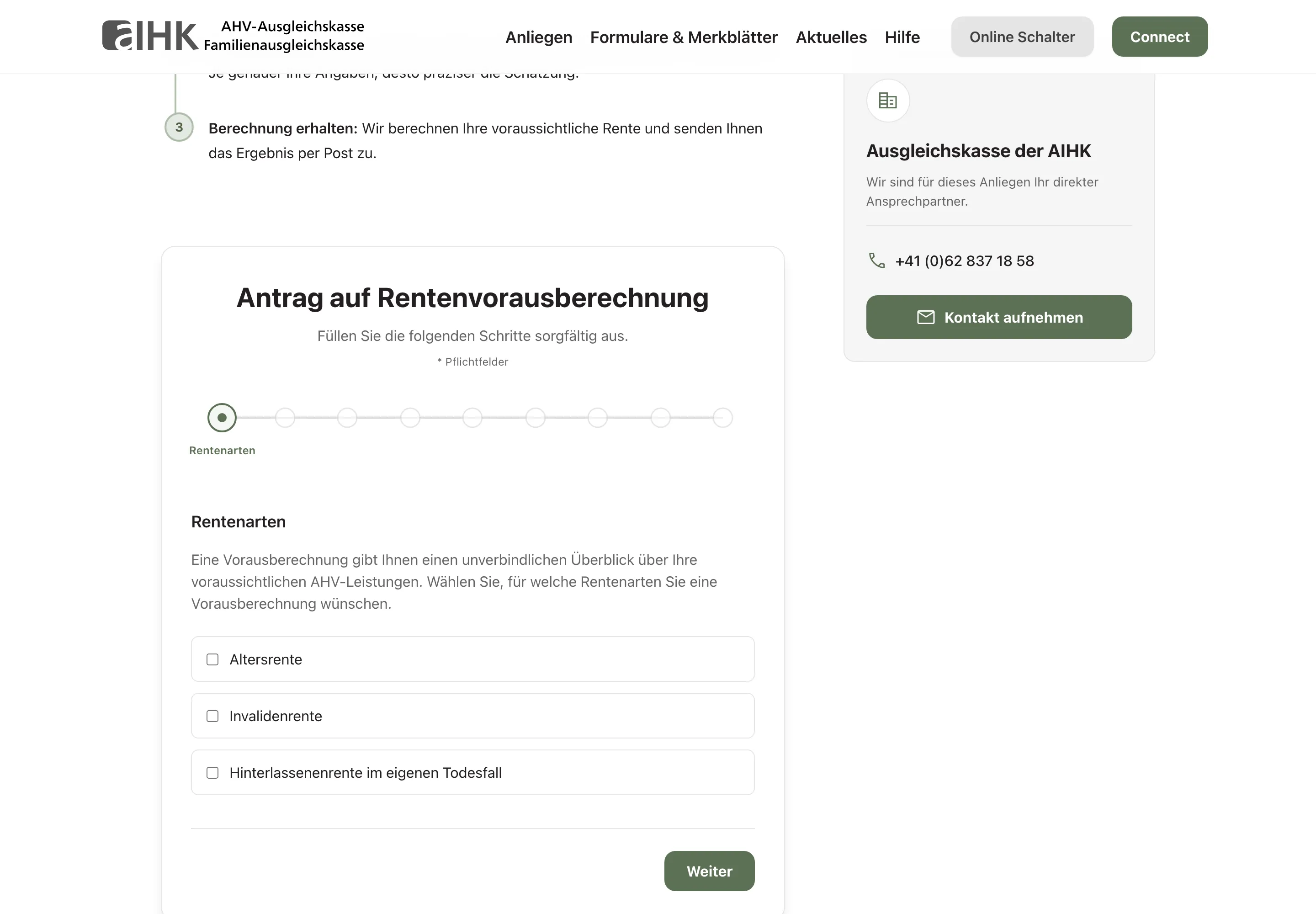 AHV AIHK — a multi-step pension pre-calculation form with a progress indicator and clear step-by-step guidance.
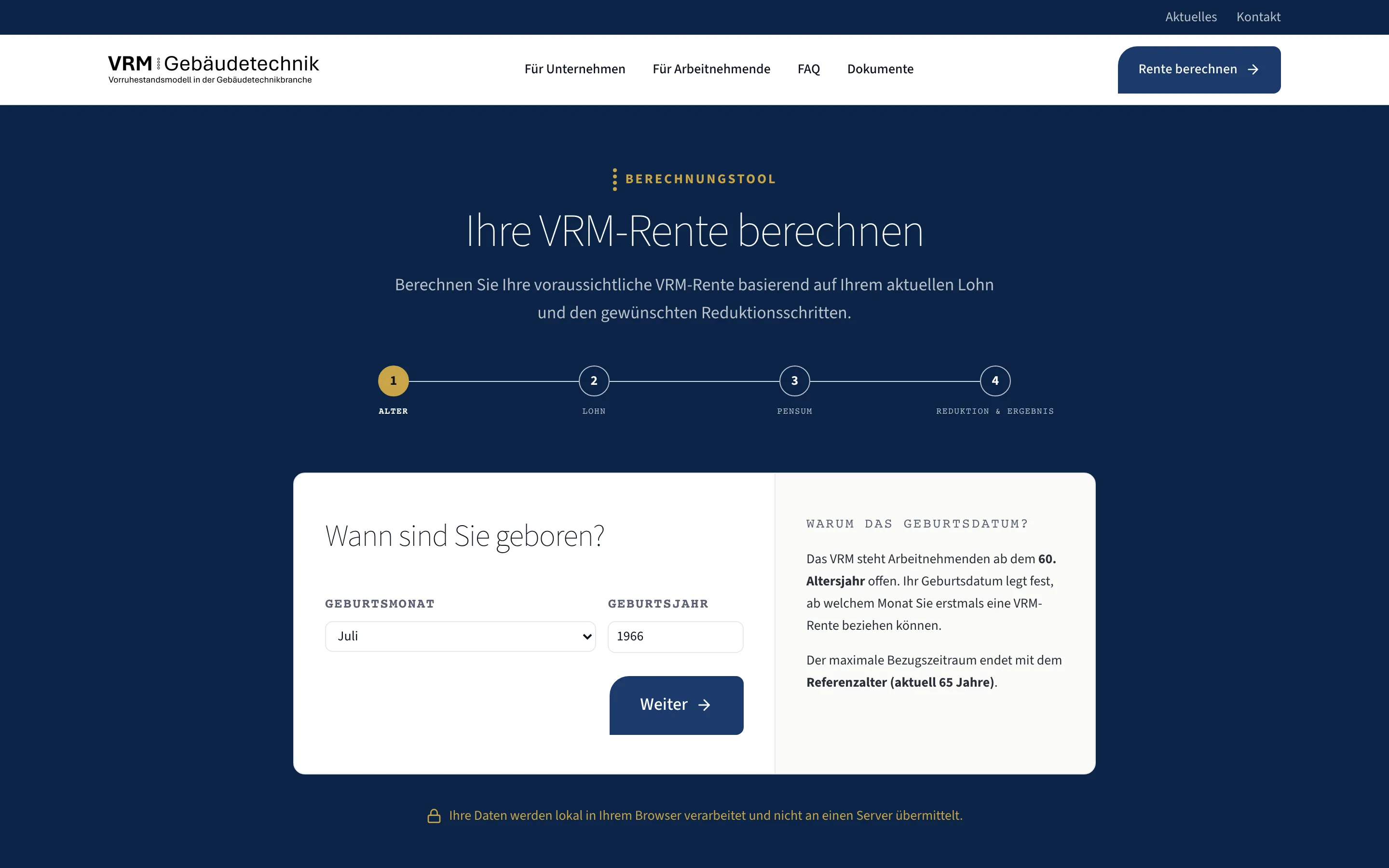 VRM Foundation — a calculation tool that guides non-experts through a complex pension calculation in four steps.
| AHV AIHK — Pension calculation form | VRM Foundation — Calculation tool | |
|---|---|---|
| Starting point | Complex pension calculation with many variables and legal dependencies | Technically demanding calculation tool for building technology pension provision |
| UX goal | Users complete the calculation — without guidance and without follow-up questions | Non-experts navigate independently through a multi-step process |
| Approach | Step-by-step guidance, clear error messages, progress indicator | Contextual explanations, logical page structure, understandable technical terms |
| Result | High completion rate, fewer support enquiries from ambiguities | Users complete complex calculations without external help |
Both projects show: good UX does not mean less content, but better structure. As of 2026.
In both cases, the visual design was clean and professional — but the real work was in the flow logic, the copy, the error handling, and the information hierarchy. That is UX work.
Good UX directly improves conversion
A website has a goal — and that goal is almost always an action: an enquiry, a call, a booking. User experience determines how many visitors actually take that step.
Every friction point in the flow is a lost enquiry. A form with too many fields. A contact path that is hidden. An offer that remains unclear on first reading. These points do not just harm usability — they cost revenue directly.
The connection is close: conversion optimisation is in many cases applied user experience. Removing friction from the flow generates more enquiries — without buying more traffic. The visitors are already there; they just cannot find a clear path forward.
Load times are part of user experience
User experience does not begin with the first visible element — it begins with the loading process. Every second of waiting is a measurable experience, and it is almost always a poor one. On mobile, a significant proportion of visitors abandon a page that takes longer than two to three seconds to load.
For Noevu websites, speed is therefore core work, not a bonus category. Near-perfect scores in Google PageSpeed tests are standard on our projects — not because it is a metric to chase, but because a fast page is a better experience.
Building pages that respond immediately on older devices, weak connections, and small screens means building a website that works for everyone — and ranks better with Google. Speed and user experience are not separate workstreams.
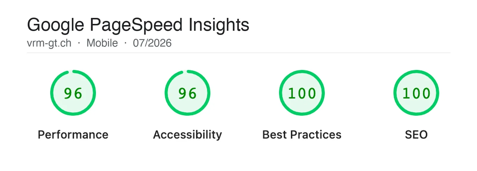
The Google PageSpeed Insights test measures more than load time — it also scores a page's accessibility. Both feed directly into user experience: a fast page that everyone can use is a better page.

Measure your own website with Google PageSpeed Insights — once for desktop, once for mobile. The mobile scores are usually lower and more revealing, because most visitors now come via mobile. Anything below 80 points demonstrably loses visitors. Anything above 90 is a directly perceptible improvement in experience.
Accessibility as part of user experience
Accessibility and user experience follow the same principles: clear structure, understandable language, logical flow, robust usability across different devices and input methods.
What makes a website more accessible for people with disabilities makes it easier for everyone. Clear contrasts help not only people with visual impairments — they help anyone looking at a screen in sunlight. Keyboard navigation helps not only people who do not use a mouse — it helps anyone who wants to fill in a form efficiently.
Web accessibility is therefore not a box to check at the end of a project, but a natural component of good UX work. Thinking inclusively from the start means building a website that works for the largest possible audience.
Assessing your own website's UX
A rough self-assessment does not require a specialist. Five short tests reveal the biggest UX gaps — in ten minutes, without any tools.
The quick UX self-check
If you stumble on several points, a more thorough look is worthwhile. Often it is a handful of specifically identifiable places that make the biggest difference — and that can be uncovered quickly in a structured conversation.
Conclusion: UX and UI — both count, but not equally
UI is the first impression. UX is what counts when someone stays.
A website needs both: the visual craft that builds trust and demonstrates professionalism, and the flow quality that ensures visitors reach their goal without friction. Anyone who takes only one of these seriously is leaving potential on the table — credibility on one side, enquiries on the other.
Understanding the difference between UX and UI helps with prioritisation. When a website does not convert, it is rarely because of the colour palette. It comes down to the clarity of the offer, the path to an enquiry, the trust that forms at the decisive moments. That is user experience — and it is the foundation of every website that truly works.

Your website looks great — but does it convert? A short conversation shows where visitors drop off and what's worth improving.
Frequently Asked Questions
What is the difference between UX and UI?
UI stands for User Interface — everything that is visible: colours, typography, layout, buttons. UX stands for User Experience — everything that is tangible: flow, clarity, whether someone reaches their goal. A website can have excellent UI and still have poor UX — if the form has too many fields, the contact path is too long, or the offer is unclear on first reading. Both dimensions are necessary; UX is the foundation.
Why is UX more important than UI?
Because the goal of a website is always an action — an enquiry, a call, a booking. Whether someone takes that step depends primarily on whether the path to it is clear and frictionless. Good visuals can support this, but not replace it. Anyone who focuses only on design and neglects the flow loses the majority of interested visitors before they even reach the form.
How do you improve the user experience of a website?
The first step is an honest audit: do visitors understand within seconds what you offer? Is the next step always visible? Does the form work on mobile without friction? Answers to these questions quickly reveal where friction arises. Then prioritise — the points with the greatest impact on enquiries first, not the most visually obvious ones.
How are UX and load times connected?
Load times are a direct UX factor. Every second of waiting increases the bounce rate — especially on mobile. Having to wait sends a signal that the website is unfinished or poorly maintained. Good user experience therefore begins before the first page has fully loaded. For us, this means speed is not a technical bonus feature, but part of the overall experience.
Do UX and UI need to be done by different people?
Not necessarily, but the disciplines require different mindsets. UX thinks in flows and user goals, UI thinks in aesthetics and hierarchies. In smaller projects these roles often overlap — what matters is that both perspectives are present. Treating UX and UI separately before bringing them together almost always produces better results than trying to do both simultaneously.