The color brown on a website: what it triggers
Brown is the color of familiar materials: wood, leather, coffee, chocolate, paper and earth. A page in brown can call up these images before anyone reads a word.
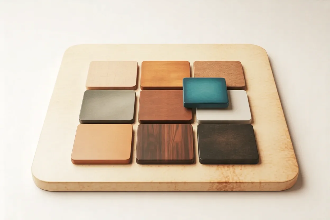
Technically, brown is a dark, muted orange. On the color wheel it sits between red and yellow, only with less lightness and saturation. That is why there is no single brown. Light Sand and deep Espresso are worlds apart, and each shade comes across differently.
For your website, what counts is which shade fits your brand in which role.
The meaning of the color brown: a reading, not proof
The common reading lists earthiness, warmth, reliability and stability. These qualities probably go back to the materials brown recalls. Context and culture shift them, and not every visitor reads the same message into it.
As a fixed effect that works the same way on everyone, this is not proven. This article is not aware of any solid measurements of brown on websites, so caution is advisable in practice.
Trust does not follow from these readings. Clear information, easy-to-read pages and visible people probably do more for trust than the color.
Don't write «brown builds trust» on your site. The claim is not proven. Say instead what brown stands for in your industry, such as wood, indulgence or nature.
Which industries brown fits
Brown works where visitors already expect the materials that go with it. Three fields come to mind, each with its own range of shades.
| Suitable shades | What to watch for | |
|---|---|---|
| Craft trades (carpentry, landscaping, saddlery) | Walnut, oak, leather | Show real photos of the work, with brown as a frame rather than a constant backdrop |
| Food and drink (coffee roastery, bakery, confectionery) | Espresso, Caramel, cocoa | Add a light shade as a balance so dark tones do not feel heavy |
| Nature (organic farm, natural cosmetics, outdoor gear) | Earth tones with muted green | Only make nature claims you can keep |
The mapping is a rough guide from design practice.
It gets harder where visitors expect speed and technology, as with software or financial products. There, a heavy brown can look old-fashioned as long as a clear counterpoint is missing.
An example from logistics shows that brown can hold its own where speed counts, too. UPS delivery trucks have been brown for generations, and the truck color became the brand's signature.
Using brown on a website: three roles
On a website, brown can take on three roles: text color, surface and accent. Decide early which ones you assign, because that sets the rest of the palette.
Brown as text color
Brown as surface
Brown as accent
You can roughly estimate how much area the base tone, the second color and the accent should get.
A well-known rule of thumb splits the area into 60 percent base tone, 30 percent second color and 10 percent accent. With brown, the base tone is often a light neutral such as Linen, and brown itself is the second color.
A brown palette to try out
The example shows three browns, two light neutrals and one counterpoint. The values are a suggestion to test.
A dark shade (Espresso) takes the text, a medium one (Walnut) the surfaces, a light one (Linen or Sand) the background. Caramel stays an accent for individual spots. These roles are usually enough to build a page, and the contrast check comes next.
Contrast: when brown stays legible
The trap is browns like Caramel, whose lightness falls between text and background. They look pleasant on screen but sit too close to the background.
The Web Content Accessibility Guidelines (WCAG) require a contrast ratio of at least 4.5:1 for normal text. For large text (from about 24 px, or 19 px in bold) and the outlines of interface controls, 3:1 is enough.
On Linen, Caramel passes only for large text and the outlines of interface controls. It fails for body text and labels. The article on web accessibility explains when such requirements become mandatory.

Test brown on a phone outdoors. In sunlight the contrast of every color pair drops, and a value that barely passes on screen can fail out there.
Complementary colors of brown and good combinations
Brown is a dark orange, so its opposite on the color wheel lies in the blues. A muted teal or blue-gray gives the palette an edge without competing with the brown.
Three combinations are worth a first test. Dark brown such as Espresso or Walnut looks calm and classic with Linen or Sand, and the contrast is high. Caramel on Sand, however, reaches only 2.8:1. Teal gives the page a clear opposite and works for links and buttons with light text. Brown with a muted green stays close to nature, but keep their lightness clearly apart, or the two shades blur.
Does brown fit your brand? Three key questions
Before brown goes into the brand decision, three questions help:
- Do visitors in your industry expect wood, coffee, leather or earth?
- Can brown be used legibly in a light, a medium and a dark shade?
- Does the color fit what your company should stand for in five years?
With three yeses, there is a fair case for brown. If the answer to the first question is no, as with software or financial products, brown needs a clear counterpoint. If the third is a no, take a look at your company's positioning. The color follows the brand. If the second is a no, the palette and contrast values above will help.
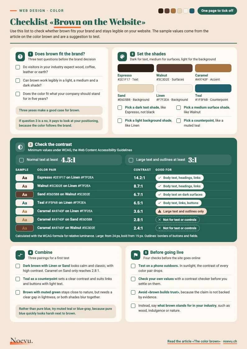
Checklist «Brown on the Website»: one page to tick off
Five sections take you from the three key questions through shades, contrast and combinations to going live. They include the swatches of the sample palette and seven contrast pairs with their values.
Thank you. Your download will start shortly.
Conclusion: from color to brand presence
Color is one part of a brand's presence. Anyone planning a relaunch first clarifies what the company should stand for, and colors, type and images follow. The basics are in the articles on corporate identity for SMEs and on visual language. The custom website design page shows how the process for a new website works.

In a short conversation, we work out together whether brown fits your brand and what a relaunch would need for it.
Frequently Asked Questions
What does the color brown mean?
In the common reading, brown stands for earth, wood, warmth and stability. This meaning probably goes back to the materials the color recalls. Shade, setting and culture shift it, so it is best read as a tendency.
Does brown make a website look trustworthy?
Brown can suit an industry such as craft trades, food and drink or nature, and feel familiar there. It cannot guarantee trust. Clear information, readable pages and visible people probably matter more for that.
Which colors go with brown?
Linen, Sand and cream make calm backgrounds on which dark browns like Espresso and Walnut reach high contrast. Teal or blue-gray adds a counterpoint, and a muted green stays close to nature. Whatever the combination, it pays to check the contrast.
What is the complementary color of brown?
Brown is a dark orange, so its opposite on the color wheel is blue. In practice a muted teal or blue-gray works well, because pure blue quickly looks harsh next to brown.
Which industries does brown suit?
Brown fits where visitors expect wood, leather, coffee or earth, as in craft trades, food and drink, and nature. For software or financial products, a heavy brown can look old-fashioned without a clear counterpoint.
What contrast does brown text need?
The Web Content Accessibility Guidelines require at least 4.5:1 for normal text. For large text and the outlines of interface controls, 3:1 is enough. Dark browns like Espresso and Walnut reach that easily on a light background. Shades like Caramel often fall short, because their lightness is close to that of the background.
What is the hex code for brown?
There is no single value. In CSS, the name «brown» stands for #A52A2A, a reddish mid-brown. For a brand, a shade of its own is worth it. Together with you, we build it in three shades: dark for text, medium for surfaces, light for backgrounds.