Visual language — briefly explained
Visual language describes the system of visual decisions that together form a recognisable brand image. It is not the individual photo — but the logic behind it. Which subjects does a brand show, in what mood, from which perspective, and with which colours?
Answers to these four questions shape the visual language long before the first image is selected. Many Swiss SMEs treat image selection as a matter of taste. In practice, it is a systems question.
Define the rules once, and every team member can evaluate any image consistently. A well-considered visual language strengthens recognition and trust — and reduces the effort behind every future image decision. Without rules, each decision starts from scratch and risks inconsistency.
Visual language encompasses all recurring decisions that shape the visual appearance of a brand — subjects, mood, composition, and style. It is the visual part of corporate identity and works recognisably before anyone has read a single sentence.
Why images work faster than any text
The human brain processes visual stimuli significantly faster than written text. In the first milliseconds, a first impression of a website forms — long before the first word is read. That first impression shapes how visitors evaluate the rest of the content.
For Swiss SMEs, this means: the hero section is one of the most expensive image decisions in the entire presence. A stock photo appearing on twelve other firm websites signals interchangeability. An authentic image of the team or the premises signals substance and independence.
A real example: a Zurich law firm replaced a generic handshake image with a portrait of its three partners — photographed in their actual meeting room, in the natural light of the neighbourhood. No new logo, no different tone — just the image. Feedback from clients afterwards: the site feels more personal and less interchangeable.
The four elements of consistent visual language
Anyone who wants to keep visual language consistent must know which four elements work together. They do not build on one another — they reinforce or weaken each other. A photo can be technically perfect and still not fit the brand if just one element breaks away.
For Swiss SMEs it is worth examining all four before the next photo shoot starts or the next image selection comes around. The effort is low; the long-term effect is significant.
Subject World
- What may be shown — and what is deliberately excluded
- Team and premises instead of interchangeable stock models
- Real tools, materials, client situations
- Effect: signals independence or interchangeability
Image Mood
- Colour temperature: warm, cool, or neutral
- Brightness: high and open, or dark and focused
- Tonality: calm, energetic, formal, personal
- Effect: sets the emotional baseline before any word is read
Composition
- Framing: close portraits, medium distance, or wide spaces
- Eye contact: direct gaze or observational scene
- Layout: centred, asymmetric, with negative space
- Effect: guides the eye deliberately through every page
Style Direction
- Photography, illustration, or AI imagery — and in which combination
- Use of brand colours as filter, accent, or background
- Image editing: subtle, documentary, or strongly stylised
- Effect: makes the brand recognisable even in a cropped image
These four elements can be defined for any SME in a two-hour workshop. The order matters: clarify the subject world first — what does the brand actually show? Mood, composition, and style follow from that, not the other way around.
When a visual language system genuinely makes sense
Not every SME immediately needs its own visual language. Those who sell purely through referrals and build no website visibility can defer the investment. As soon as the website functions as a sales room, trust signal, or recruiting platform, a visual language almost always pays off.
Four typical triggers make it unavoidable. When one applies, visual language is no longer a nice-to-have — it becomes a prerequisite for the website investment to have any effect. For the audience clarity needed beforehand, the persona framework for SMEs provides the right groundwork.
The four most common triggers
The last two triggers often go together. When the founder's personal branding grows, the company's visual language automatically becomes part of it — more in the Personal Branding guide for SMEs.
A building services SME from Aargau invested two years ago in a one-day shoot of their staff on construction sites — cables in hand, real clients in the background. The images replaced all stock photos on the website. Since then — according to the team — more applications arrive directly through the careers page, and initial conversations start less often with explanations about the company.
When the effort is not worth it
Equally important is the honest counter-question: when is a visual language system the wrong next step? Those without the budget or still searching for their positioning waste money on images that will have to be replaced when strategy shifts anyway.
In these four situations, patience is smarter than action. Visual language can wait until the foundation is in place.
When the effort comes too early
Authentic photos, AI imagery, or illustration — what works when?
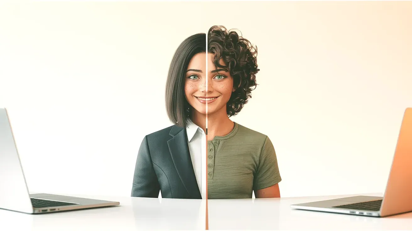
The most common question in visual language conversations in 2026: do companies still need real photo shoots, or does AI suffice? The answer involves both — but not for the same places on the website.
Three data points from recent studies help with the decision. First: per iStock VisualGPS 2026, 68 percent of German-speaking consumers prefer real photos over AI imagery — especially for people and trust content. Second: 78 percent rate AI-generated images as inauthentic, per PhotoRoom's industry analysis. Third: 67 percent expect transparent labelling when AI was involved.
For team photos and trust content, real photography remains indispensable. For abstract or conceptual visuals — blog heroes, illustration patterns, slide backgrounds — AI imagery is an efficient tool. Stock falls in between and requires very strict curation, otherwise the presence tips into the generic.
| When it fits | When it harms | Cost level | |
|---|---|---|---|
| Authentic photography | Team page, about us, service scenes, careers content, trust signals | Rapidly changing mood images, abstract concepts, frequent repetition | Medium to high — shoot plus post-processing per person or location |
| AI-generated imagery | Blog heroes, illustration patterns, backgrounds, abstract concepts, slide visuals | Team photos, about page, client situations, content where disclosure is expected | Low — tool subscription plus time for prompting |
| Custom illustration | Explainer graphics, process diagrams, brand patterns, technical visualisations | People depictions, trust content, proof of service | Medium — designer hours per visual |
| Stock photography | Secondary content without brand statement, blog companion images, quick gap fillers | Hero section, team page, identity-defining content | Very low — per image or subscription |
One point matters here: AI imagery does not replace a team photo shoot. Using an AI-generated portrait on the team page risks the trust that an about page is meant to build. The effect does not show in analytics — it shows in the quiet click-away.
For those who need blog covers for 30 articles per year, AI saves hundreds of hours of research and editing. Practical recommendation: first decide which content genuinely requires real photography — everything else is negotiable between AI imagery, illustration, and carefully curated stock.
Building a visual language: four steps for SMEs without a marketing department
Most visual language projects fail not because of taste, but because of order. Those who start with image selection are reaching for the tool too early — and miss the system behind it.
Four steps lead an SME without a marketing department to a workable visual language. They can be completed in two half-days. The result is a document every team member keeps in mind when selecting images.
Four steps to your own visual language

Write the five yes-or-no checklist questions so that anyone on the team can answer them in 30 seconds. Example: «Are these real people from the team?» Or: «Does the light feel warm like the hero section?» Questions that are too abstract bring back the taste argument — and every image choice lands on the owner's desk again.
Applying visual language on your website
On the website, visual language becomes a concrete decision — pixel by pixel. Five spots are especially sensitive: the hero section, the about page, service pages, blog visuals, and the preview image LinkedIn or Google displays. At each of these spots, the image choice determines how professional and distinctive the brand feels.
For most Swiss SMEs, a sensible distribution looks like this: hero and about use only real photography of the team or the premises. Service pages use curated detail photos or coherent AI visuals. Blog uses AI-generated images that carry the brand palette. Preview images use a reusable template where only the title and background accent change.
Visual language is the visual part of corporate identity. It only works when it aligns with the strategy. Without a CI framework, or with content that follows different rules, the presence quickly breaks apart again.
AI portraits on the team page: immediately feels inauthentic and undermines the trust that an about page is meant to build.
Three different photo styles on one page: stock, smartphone snapshot, and professional shoot side by side — the presence looks random rather than deliberate.
No image budget for maintenance: a photo session without a plan for the next twelve months ages faster than expected.
Preview images as an afterthought: LinkedIn and Google show a preview image for every article — ignoring this wastes half of every visibility opportunity.
Visual language only for the marketing team: when the sales team uses its own images in proposals and slides, consistency breaks at the most important moment.
Conclusion
Visual language is not a design detail. It is the system that turns random image selections into a recognisable brand presence. That holds even when different people buy images, prompt AI, or brief photographers across an entire year.
Clarify the four elements, work through the four steps, and the result is a visual world that holds up. It functions without daily taste debates — and without leadership signing off on every image choice.
Anyone who finishes reading and is unsure whether their website still carries a consistent visual language will find quick clarity in the free visual language check — not through a generic answer, but through the right question for the specific situation.

Noevu connects brand strategy, AI imagery, and web implementation — from the mood board to a finished website with consistent visual language.
Frequently Asked Questions
What does visual language mean, simply explained?
Visual language describes the system of visual decisions — subject world, image mood, composition, and style — that together form a recognisable brand image. It is not the individual photo but the logic behind it. A consistent visual language is felt by website visitors, even without them ever having heard the term.
How does an SME without a design team develop its own visual language?
In four steps and roughly two half-days of work. First, clarify values and descriptive adjectives. Then build a mood board with 20 reference images. Then write the rules for each element in one paragraph. Finally, create a checklist of five yes-or-no questions for everyday image selection. The result is a two-page style guide document that lets the whole team evaluate images independently.
Are AI-generated images suitable for a brand?
Partially. For abstract or conceptual visuals — blog heroes, background patterns, slide visuals — AI imagery is an efficient tool. For team photos, the about page, or client situations, real photography cannot be replaced. User studies show that a majority consider AI imagery less authentic, and many consumers expect transparent labelling when AI was involved. An honest visual language uses both tools — but in the right places.
What does a visual language system cost for a Swiss SME?
The conceptual part — workshop, mood board, style guide — starts at around CHF 1,200 for a half day with an agency or freelancer. A professional team photo shoot adds CHF 1,500 to CHF 4,000, depending on the number of employees and locations. A complete visual language including style guide, shoot, and a set of AI image templates for blog and social media typically falls between CHF 4,000 and CHF 9,000. A firm figure only emerges in a proposal after an initial visual language conversation.
When should an SME revise its visual language?
Four triggers are typical: a website relaunch, a new target audience or repositioning, a growing personal brand for the owner, or perceived interchangeability with competitors. When one of these applies, a short visual language audit is worthwhile before the next photo is taken or the next AI image series is planned.